Math Workout for the GRE, 3rd Edition (2013)
Chapter 5. Charts and Crafts
THE JOY OF VISUAL DATA
GRE chart questions are pretty straightforward; you read a couple of charts and/or graphs and then you answer some questions about them.
Chart questions will appear on a split screen; the chart(s) will appear on the left, and the questions will be on the right. When a chart question pops up, be sure to start by hitting the scroll bar to see just how much data you’re dealing with. There might be a second chart hidden below the first one, so don’t get thrown off if you see questions about a chart you don’t think exists.
Chart questions test four primary skills.
• how well you read charts
• how well you approximate percentage and percentage change
• how well you calculate exact percentage and percentage change
• how well you synthesize related data from two separate sources
When you have to answer chart questions, there are a couple things to remember.
1. Read all the charts. Before you answer any questions about a set of charts, look over the charts. Make sure you pay particular attention to the units involved. Is each axis in terms of a number of people, a percentage, a dollar amount? Look for a legend for the charts. Are we talking about 100 people, or 100 million people? Check to see if you need to scroll down for any additional charts. If there are multiple charts, spend a minute or so figuring out how the charts relate to each other. Do the charts show different aspects of the same information? For instance, does one chart show the jobs of a group of people, whereas the other chart shows the education level of those same people? Does one chart give more detail about a limited sliver of information from the previous chart? Spending time understanding the charts now will pay off later.
2. Find the information you need. Once you read a charts question, figure out which chart and which data points you need to look at.
3. Use your scratch paper and label your information. Find the data points you need to answer the question, and write each one down on your scratch paper. Include units and a name for each data point. Don’t just write “23.” Write: “2004 imports − 23 mil tons.”It only adds an extra couple of seconds of time, and makes it much less likely that you will make a mistake or get lost in the problem.
4. Estimate before you calculate. Look to eliminate answers before doing too many calculations. If 226 of the 603 employees were fired, and the question wants to know what percentage were fired, then do a quick estimation: 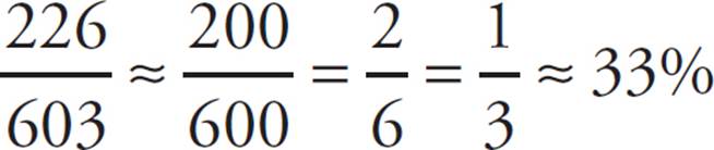 . Since we rounded 226 down to 200, our answer will probably be a bit larger than 33%. Cross off any answers that are 33% or less, or much greater than 40%. If we can’t choose an exact answer based on our estimation, then we can go back and calculate afterwards.
Percentage Change Quick Quiz
Remember all the reading you did about percentages and percent change in Chapter 3? Well, here are some questions. Let’s see how much skill you’ve retained:
Question 1 of 5
If Amy’s stock portfolio grew from $1,200 to $1,600 in January, by approximately what percent did it increase during the month?
![]() 25%
25%
![]() 33%
33%
![]() 40%
40%
![]() 67%
67%
![]() 75%
75%
Question 2 of 5
If she withdrew 30% of her money in February, how much was left in her brokerage account?
![]() $360
$360
![]() $480
$480
![]() $720
$720
![]() $840
$840
![]() $1,120
$1,120
Question 3 of 5
Amy’s portfolio increased by 25% of its value in the first two weeks of March but lost 25% in the last two weeks.
|
Quantity A |
Quantity B |
|
The amount left in the account at the end of February |
The amount of money left in her account at the end of March |
![]() Quantity A is greater.
Quantity A is greater.
![]() Quantity B is greater.
Quantity B is greater.
![]() The two quantities are equal
The two quantities are equal
![]() The relationship cannot be determined from the information given.
The relationship cannot be determined from the information given.
Question 4 of 5
If her portfolio increased by 200% during the month of April, what was her new balance at the end of April?

Question 5 of 5
By approximately what percent did Amy’s portfolio increase between January 1 and April 30 ?
![]() 32%
32%
![]() 49%
49%
![]() 62%
62%
![]() 163%
163%
![]() 213%
213%
Explanations for Percentage Quick Quiz
1. If Amy’s stock portfolio grew from $1,200 to $1,600 in January, then the change is 1,600 − 1,200, or $400. The percent change is 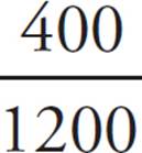 × 100 or 33%. The answer is (B).
2. If she started with $1,600 and withdrew 30% of her money, then she withdrew 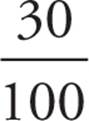 × 1600 or $480. She therefore had $1,600 − $480, or $1,120 left. (Note: You can solve this with one fewer step if you realize that by taking out 30%, Amy left 70% in her account; 70% of 1,600 is 1,120.) The answer is (E).
3. The numbers might suggest that her balance didn’t change (25% up and 25% down might look like they cancel out), but as we’ll see, it did. If Amy’s portfolio increased by 25% of its value in the first two weeks of March, the balance rose by 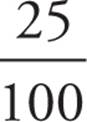 × 1120, or $280, to $1,400. Then, if it lost 25% in the last two weeks, the balance fell from $1,400 to
  × 1400, or $1,050. She had less money at the end of March than at the end of February, so the answer is (A).
4. The wording of this is a little tricky, because if something increases by 200%, it is adding an amount that is double the original value. (In effect, increasing by 200% is the same thing as tripling.) Because 200% of $1,050 is $2,100, the new value of the portfolio at the end of April was $1,050 + $2,100, or $3,150.
5. Amy started out with $1,200, and at the end of April she had $3,150. Over the four months, the portfolio gained $3,150 − $1,200, or $1,950, in value. Without even using your calculator, you should be able to see that the new value is more than double the old value but less than triple the old value. This means that the portfolio increased by between 100% and 200%. The answer must therefore be (D), because no other answer choice is even close.
FOCUS MINIMIZES CARELESSNESS
Reading charts is a lot like interpreting points that are graphed on the coordinate plane. It’s a process that anyone can learn with practice. The worst thing about GRE charts, however, is that they are often intentionally confusing and/or difficult to read, so it’s easy to make careless mistakes under stressful conditions. Above all else, resolve to be calm and systematic when you navigate the data that the GRE throws at you. If you can manage that, the rest should fall into place nicely.
The Formats
Most chart questions come in three formats: bar or line graphs, pie charts, and data tables. Additionally, the test often gives you two separate charts that are somehow related, however remotely.
Data tables are made up entirely of numbers, so all you need to do is crunch the numbers. Graphs and charts can be a little trickier because they require you to interpret them visually.
Bar Graphs
On bar graphs, data points are indicated with rectangular bars that can run either horizontally or vertically. Bar graphs get tricky when one bar contains two or more bits of data that are often colored or patterned differently, like this:
Line Graphs
Line graphs are very similar to bar graphs except they link data points with lines that can indicate overall trends.
Pie Charts
Pie charts divide up all data into wedges, each of which indicates a percentage of the whole. All of the percentages should total to 100%, and the bigger the wedge, the bigger the percentage.
Data Tables
Sometimes the GRE does away with graphics altogether and simply presents raw data in several rows and columns.
Number of Driver’s Licenses Applied For, in millions
Ballparking, Redux
Many times, the numbers you’ll work with will be approximations rather than exact calculations. Working well with these approximations is an important skill.
Let’s look at an example: About how much bigger, in terms of a percentage, is the bar on the left than the bar on the right?

Pretty hard to tell, isn’t it? Now look at those same bars placed next to each other:

When the bars are adjacent, it’s a little easier to compare their relative size. The bar on the left is about half again as big, or 50% bigger. You can confirm this when the two bars are next to a vertical scale:
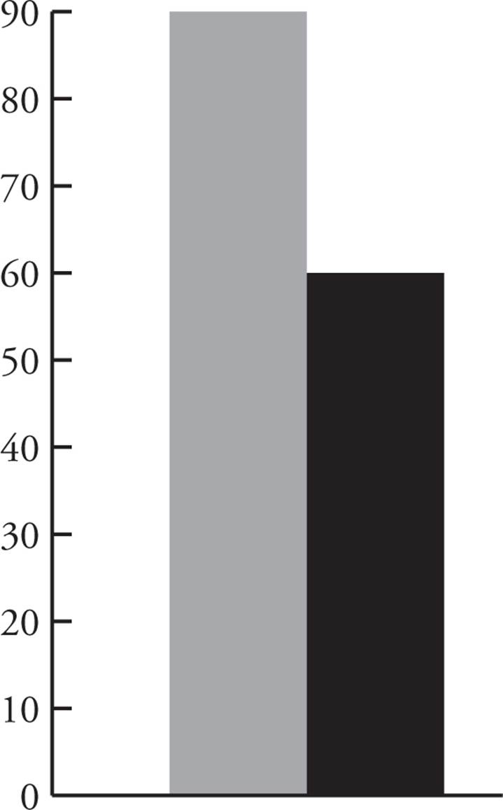
Now you have a very good (though not necessarily exact) idea of how large each bar is, and you can crunch some numbers to determine the percent decrease from Bar A to Bar B or the percent increase from Bar B to Bar A. Let’s work that into a sample question, shall we?
![]()
Question 16 of 25
|
Quantity A |
Quantity B |
|
The percent increase from Bar A to Bar B |
The percent decrease from Bar B to Bar A |
![]() Quantity A is greater.
Quantity A is greater.
![]() Quantity B is greater.
Quantity B is greater.
![]() The two quantities are equal.
The two quantities are equal.
![]() The relationship cannot be determined from the information given.
The relationship cannot be determined from the information given.
Here’s How to Crack It
For this question, you can estimate the value of each bar. Bar A is approximately 55; the value of Bar B is approximately 85. Now you can use the percent-change formula (divide the change by the original value, then multiply by 100) to find your answer.
The change from A to B is 30, and the original value is 55, so the percent increase is  × 100 or approximately 50%. Conversely, the percent decrease from B to A is
  × 100 or approximately 33%. The answer is (A).
![]()
The Power of Guesstimation
Have you ever heard the expression “Almost only counts in hand-grenades and horseshoes”? Well, you can add “GRE charts” to that list. Approximating values is an important skill when you’re interpreting charts, because as we saw in the previous example, the value might not necessarily sit directly on a calibration line.
If the test asks you to estimate something, the answer choices will not be very close together. If the right answer is 47%, for example, you won’t see 44% or 50% among the answer choices because they’re too close to the right answer. Someone could easily be just a little off in his estimations and get 44% rather than 47%. ETS doesn’t want to leave any room for dispute, because they don’t want complaints from test takers.
If you don’t feel confident in your abilities to estimate, resolve to practice on as many chart questions as you can until you’re more confident. Greater skill will come with time, diligence, and patience.
Here’s an example of how a series of chart questions might look.
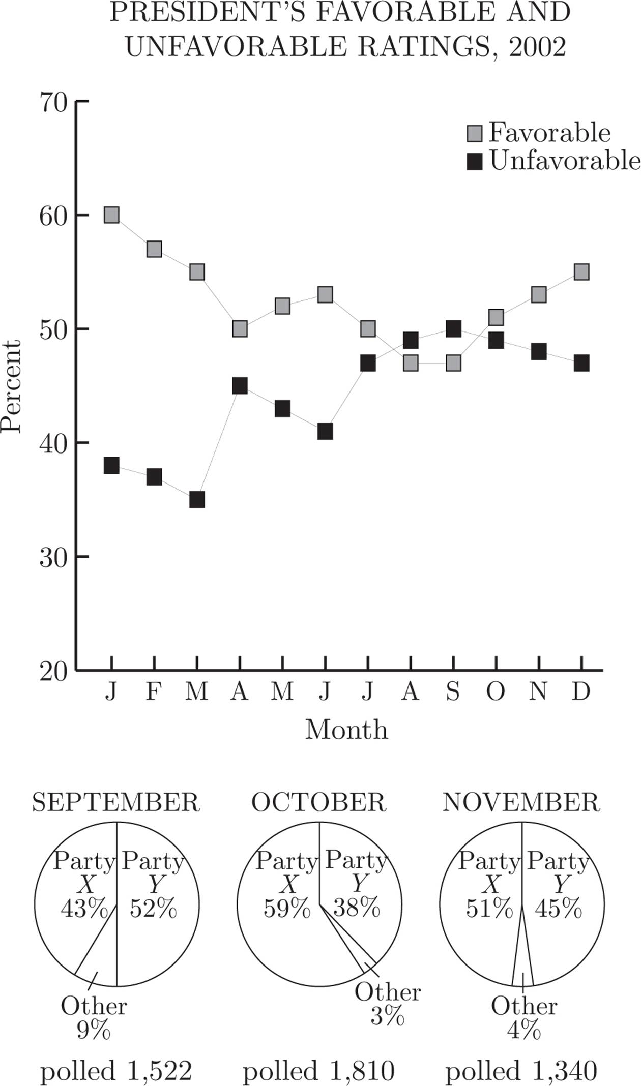
Questions 6−8 refer to the following graphs.
![]()
Question 6 of 20
In which month did the difference between the percentages of the favorable and unfavorable ratings of the president shrink to less than 10% ?
![]() March
March
![]() April
April
![]() May
May
![]() August
August
![]() November
November
Here’s How to Crack It
The favorable/unfavorable ratings are displayed in the line chart. During the first several months, the gap between the favorable and unfavorable ratings narrows steadily. In January, the favorable ranking is just under 60% and the unfavorable is under 40%. That’s too far apart. In April, however, the favorable rating drops to around 52%, while the unfavorable rating rises to around 45%. This is clearly less than 10%, and the answer is (B).
![]()
![]()
Question 7 of 20
How many people who were polled in November identified themselves as members of party Y ?
![]() 413
413
![]() 536
536
![]() 603
603
![]() 723
723
![]() 891
891
Here’s How to Crack It
Now we’re looking at the pie charts, because they’re the ones that reference the party affiliations of those polled. The November pie is on the far right, and 45% of the 1,340 people said they belonged to party Y. Because 1,340 × 0.45 = 603, the answer is (C).
![]()
![]()
Question 8 of 20
In which month was the greatest percentage of poll respondents undecided?
![]() March
March
![]() May
May
![]() June
June
![]() October
October
![]() November
November
Here’s How to Crack It
We’re back to the line graphs, which indicate the percentages of favorable and unfavorable votes. Throughout the chart, the two percentages don’t add to 100%; the chart explains that the remaining percentages were undecided. In March, the favorable percentage was around 56%, and the unfavorable percentage was only around 36%. These numbers therefore account for only 92% of the respondents; therefore, 8% of them must have indicated that they were undecided. This is by far the largest value of undecideds among the five answer choices given. The answer is (A).
![]()
And that’s the basic idea behind Charts questions. The wall of data is supposed to be intimidating, especially under test-taking pressure. But if you pay attention, keep your cool, and work methodically—and keep practicing—you’ll find they can be very approachable.
Charts and Crafts Drill
Questions 1−5 refer to the following graphs.
Question 1 of 15
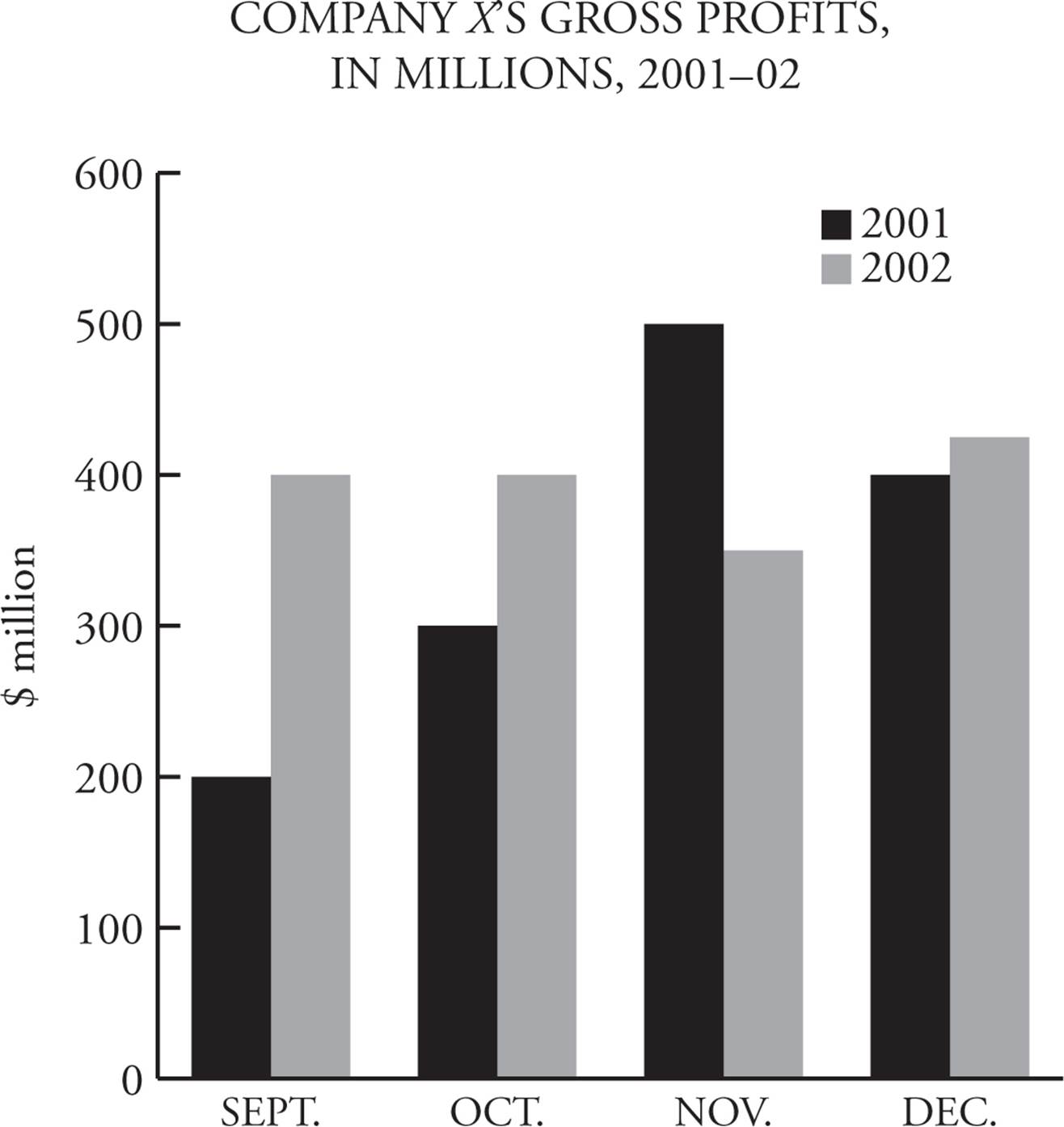
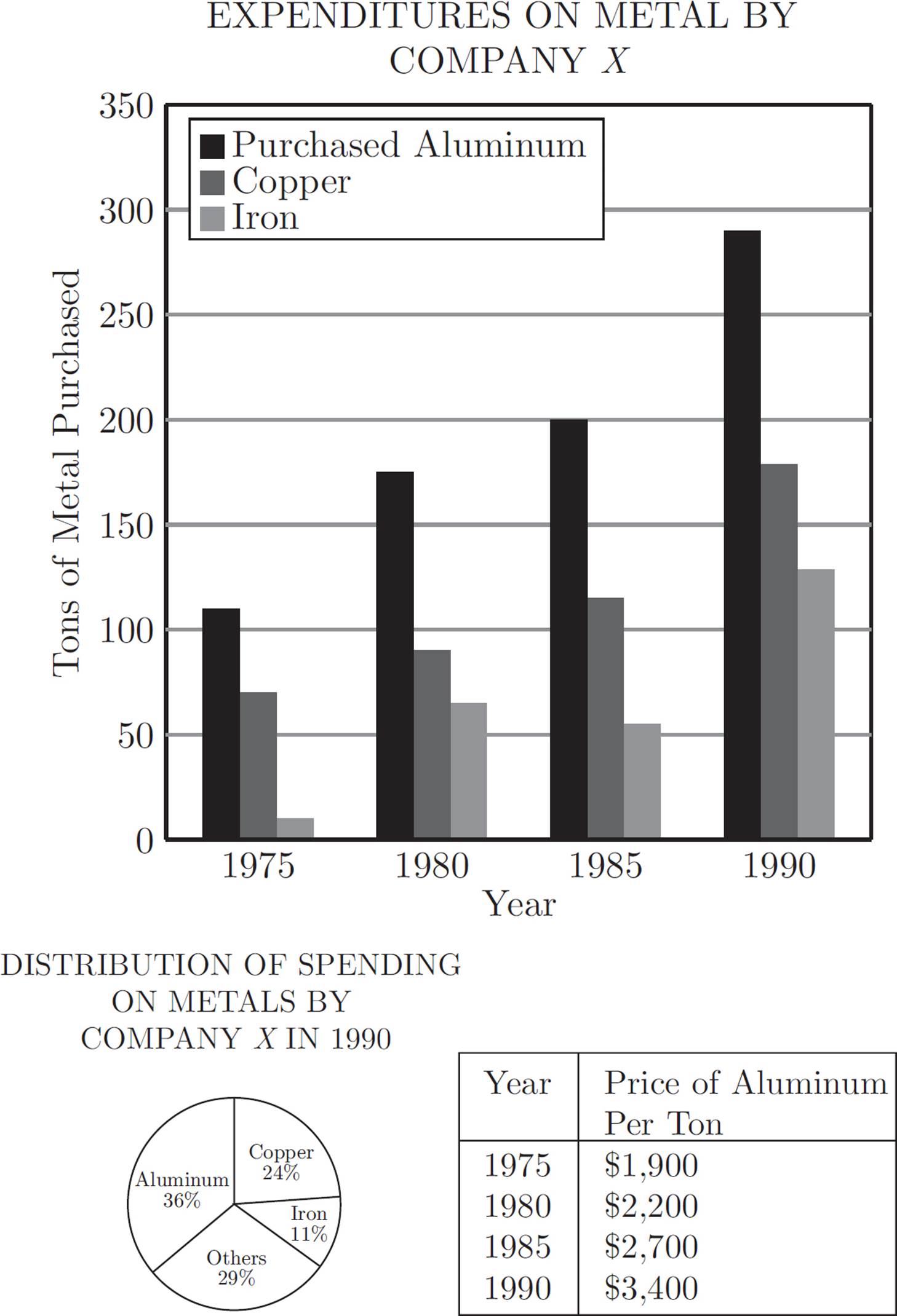
Approximately how many tons of aluminum and copper combined were purchased by Company X in 1985 ?
![]() 75
75
![]() 265
265
![]() 325
325
![]() 375
375
![]() 470
470
Question 2 of 15
Approximately how much did Company X spend on aluminum in 1980 ?
![]() $675,000
$675,000
![]() $385,000
$385,000
![]() $330,000
$330,000
![]() $165,000
$165,000
![]() $139,000
$139,000
Question 3 of 15
Approximately what was the percent increase in the price of aluminum from 1975 to 1985 ?
![]() 8%
8%
![]() 16%
16%
![]() 23%
23%
![]() 30%
30%
![]() 42%
42%
Question 4 of 15
In 1990, if Company X spent $3,183,000 on metals, what was the approximate price per ton of iron?
![]() $1,040
$1,040
![]() $2,000
$2,000
![]() $2,800
$2,800
![]() $3,400
$3,400
![]() $4,670
$4,670
Question 5 of 15
Which of the following can be inferred from the graphs?
Indicate all such statements.
![]() Company X spent more on copper than it did on iron in 1975.
Company X spent more on copper than it did on iron in 1975.
![]() The price per ton of copper was more than that of aluminum in 1990.
The price per ton of copper was more than that of aluminum in 1990.
![]() Company X purchased less iron in 1990 than it did “Other” metals in 1990.
Company X purchased less iron in 1990 than it did “Other” metals in 1990.
Questions 6−10 refer to the following graphs.
PRODUCT SALES AND EMPLOYEES OF FOUR LEADING ELECTRONIC COMPANIES IN 1988
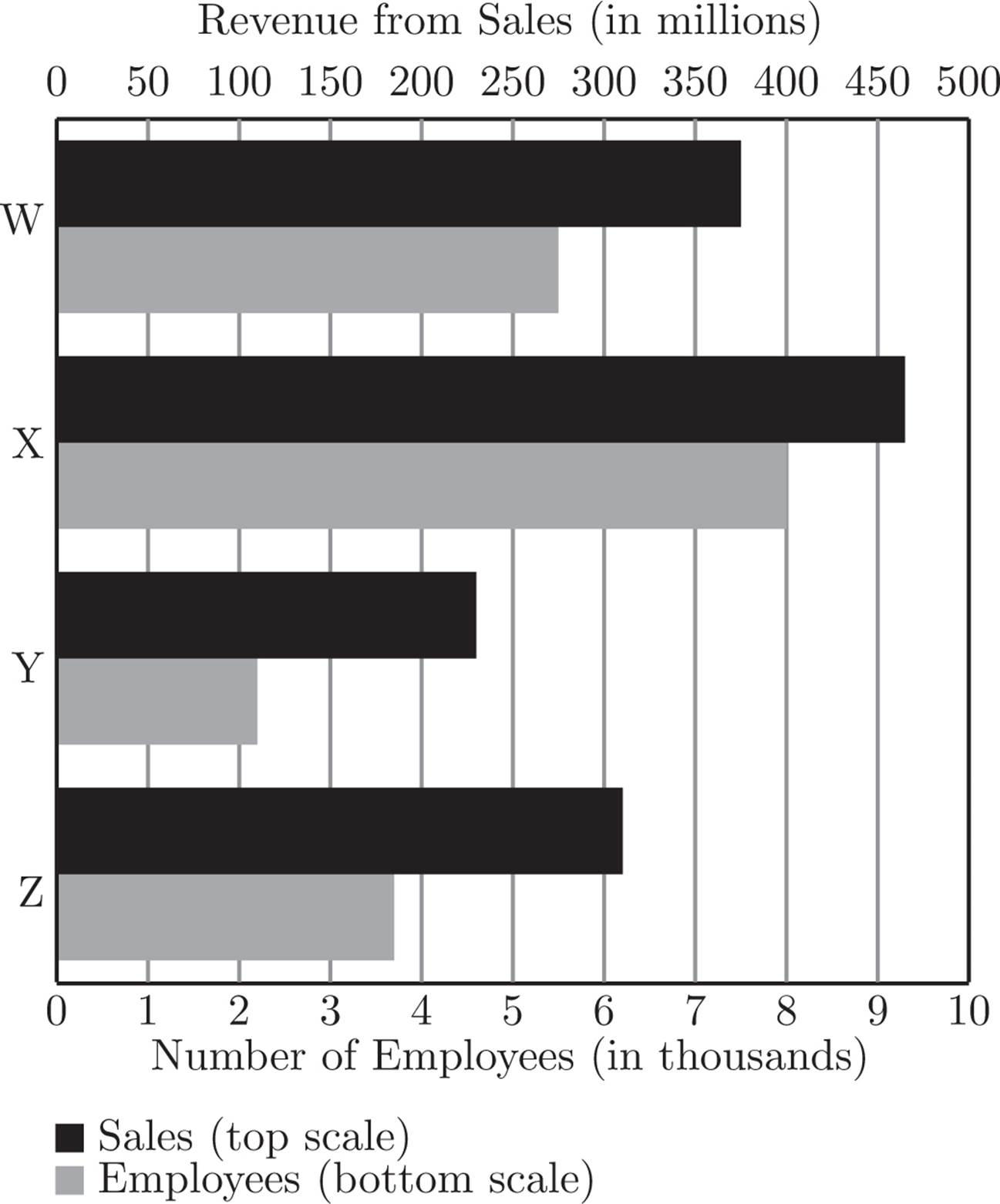
DISTRIBUTION OF SALES RECEIPTS BY PRODUCT FOR COMPANY W, 1988 (in millions of dollars)
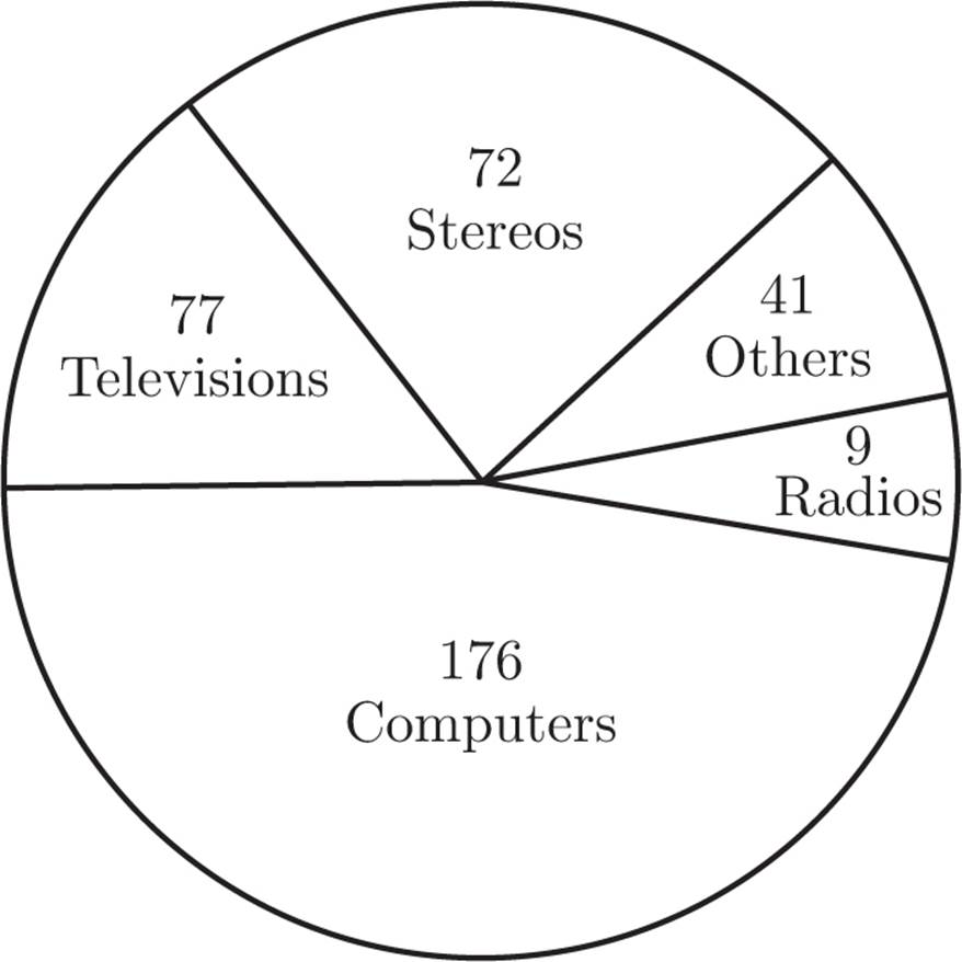
Note: Not drawn to scale.
Question 6 of 15
In 1988, what was the approximate revenue from sales, in millions of dollars, for Company Y ?
![]() 110
110
![]() 235
235
![]() 310
310
![]() 375
375
![]() 475
475
Question 7 of 15
In 1988, how many of the four leading electronics companies employed at least 4,000 people?
![]() None
None
![]() One
One
![]() Two
Two
![]() Three
Three
![]() Four
Four
Question 8 of 15
In 1988, which of the four leading electronics companies had the highest revenue from sales per employee?
![]() W
W
![]() X
X
![]() Y
Y
![]() Z
Z
![]() It cannot be determined from the information given.
It cannot be determined from the information given.
Question 9 of 15
What was the approximate average (arithmetic mean) of revenue from sales, in millions of dollars, for the four leading electronics companies in 1988 ?
![]() 290
290
![]() 345
345
![]() 375
375
![]() 420
420
![]() 460
460
Question 10 of 15
By what percentage were receipts from computer sales greater than receipts from stereo sales for Company W in 1988 ?
![]() 7%
7%
![]() 59%
59%
![]() 104%
104%
![]() 144%
144%
![]() 244%
244%
Questions 11−15 refer to the following graphs.
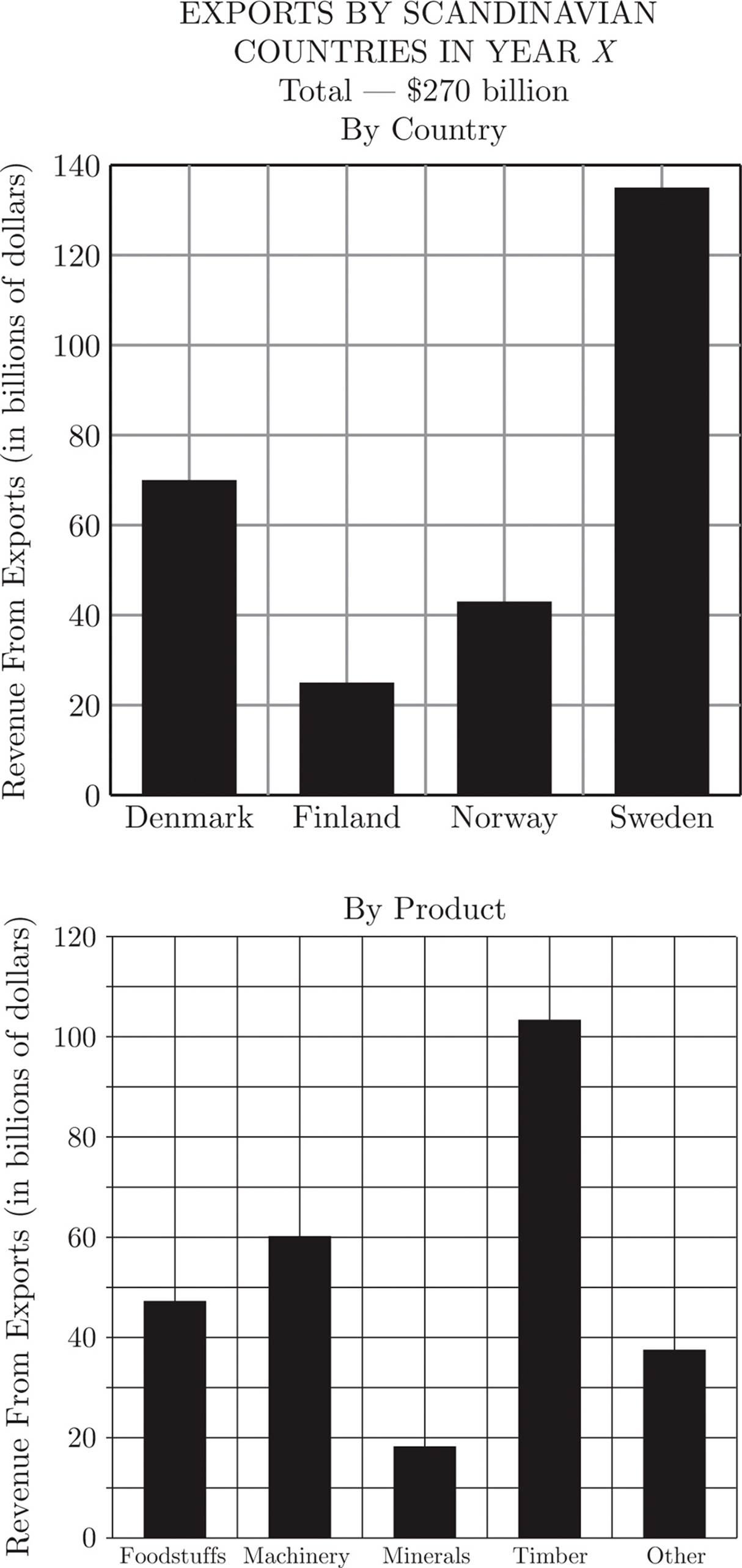
Question 11 of 15
In Year X, which of the following products represented between 15 percent and 20 percent of the total revenue from all Scandinavian exports?
![]() Foodstuffs
Foodstuffs
![]() Machinery
Machinery
![]() Minerals
Minerals
![]() Timber
Timber
![]() Other
Other
Question 12 of 15
If Sweden, Denmark, and Finland exported 30, 18, and 6 billion dollars worth of machinery, respectively, approximately how many billion dollars worth of machinery did Norway export in Year X ?
![]() 62
62
![]() 43
43
![]() 19
19
![]() 12
12
![]() 8
8
Question 13 of 15
Approximately how many billions of dollars worth of minerals did Denmark export in Year X ?
![]() 5
5
![]() 18
18
![]() 48
48
![]() 67
67
![]() It cannot be determined from the information given.
It cannot be determined from the information given.
Question 14 of 15
In Year X, if foodstuffs accounted for 15 percent of the revenue from all Swedish exports, and if the revenue from foodstuffs exported by Norway was 40 percent less than the revenue from foodstuffs exported by Sweden, then foodstuffs accounted for approximately what percent of the revenue from all Norwegian exports?
![]() 8%
8%
![]() 20%
20%
![]() 28%
28%
![]() 44%
44%
![]() 60%
60%
Question 15 of 15
If, on average, 10 pounds of exported timber were worth $1, and 4 pounds of exported foodstuffs were worth $1, what was the approximate ratio of the number of pounds of exported timber to the number of pounds of exported foodstuffs for the four Scandinavian countries in Year X ?
![]() 5 : 4
5 : 4
![]() 2 : 1
2 : 1
![]() 5 : 2
5 : 2
![]() 4 : 1
4 : 1
![]() 5 : 1
5 : 1
EXPLANATIONS FOR CHARTS AND CRAFTS DRILL
1. C
There were 200 tons of aluminum and 125 tons of copper purchased in 1985. The sum is 325.
2. B
There were 175 tons purchased in 1980. 175 tons × $2,200 per ton = $385,000.
3. E
The price per ton of aluminum was $1,900 in 1975 and $2,700 in 1985. Therefore,  × 100 =
 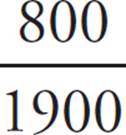 × 100 = 42 percent.
4. C
If Company X spent $3,183,000 on metals and 11 percent of that on iron, then 3,183,000 × .11, or $350,130, was spent on iron. Divide $350,130 by 125 tons of iron to find that the price per ton of iron is approximately $2,800.
5. B
Statement (A) cannot be inferred because we do not have information on the price of copper or iron in 1975 and Statement (B) cannot be inferred because we do not have information on how many tons of “Other” metals were purchased in 1990 so Statement (B) must be true because all that apply questions must have at least one correct answer. Although the ratio of aluminum spending to copper spending is 36 to 24, the ratio of amount of aluminum purchased to amount of copper purchased (295 tons to 175 tons) exceeds the 36 to 24 ratio. This means that copper cost more per ton than did aluminum.
6. B
The bar graph indicates that Company Y had sales of approximately $235 million in 1988.
7. C
The bar graph shows that Company W and Company X have more than 4,000 employees.
8. C
Set up fractions of revenue over employees: Company W = 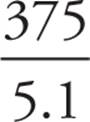 , Company X =
 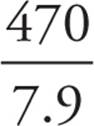 , Company Y =
 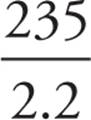 , and Company Z =
  . Company Y has highest revenue from sales per employee.
9. B
Company W had $375 million in sales, X had $470 million, Y had $235 million, and Z had $305 million. The average is the total (375 + 470 + 235 + 305 = 1,385) divided by 4, or approximately $345 million.
10. D
Stereo receipts were $72 million, and computer receipts were $176 million. The percent change is × 100 = 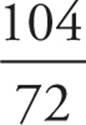 × 100, which is 144 percent.
11. A
Foodstuffs make up about $48 billion of the $270 billion total Scandinavian exports. 15 percent of 270 is 40.5 and 20 percent of 270 is 54. Foodstuffs are the only export that falls within that range.
12. E
Sweden, Denmark, and Finland account for $54 billion in machinery exports out of a total of $62 billion. Therefore, Norway must account for the remaining $8 billion.
13. E
Denmark accounts for approximately 25 percent of the revenue from total Scandinavian exports, but you cannot assume that Denmark accounts for 25 percent of each of the different products. There is no way to determine what Denmark produces in terms of minerals for export.
14. C
Revenue from all Swedish exports was approximately $132 billion, and 15 percent of 132 is $19.8 billion. Revenue from Norwegian food stuffs is 40 percent less than $19.8 billion, or approximately $12 billion. $12 billion out of a total of $42 billion is approximately 28 percent.
15. E
If $1 buys you 10 pounds of timber, then $103 billion buys you about 1,000 billion pounds of timber. Similarly, if $1 buys you 4 pounds of foodstuffs, then $48 billion buys you about 200 billion pounds of foodstuffs. Therefore, the ratio of pounds exported timber to pounds exported foodstuffs is 1,000 to 200, or 5 to 1.