Basic Math and Pre-Algebra
PART 4. The State of the World
CHAPTER 20. Measures of Center and Spread
The Separators
For small sets of data, you can take in the whole of the data set at once. The five test grades you earned over the course of a semester probably don’t need to be broken up to help you understand them. But for larger sets, especially for very large collections of data, being able to divide the list up in organized ways can allow you to make comparisons that help you understand the important information.
You might want to compare numbers within the data set, or you might want to make comparisons between two related data sets. If a researcher was conducting a study on the cancer drugs, she might want to compare the test results for two subjects in the same drug trial, perhaps to see if gender or other factors changed the drug’s effectiveness, or she might want to compare the results of the trials of two similar drugs to see which might be more effective.
Quartiles and Percentiles
The most common ways of dividing up data sets are quartiles and percentiles. Quartiles divide the data into four equal parts, or quarters. Percentiles divide the data into 100 equal parts. Remember that percent means out of 100.
You could divide the data into any number of equal parts, and sometimes people do use other “tiles.” Quintiles divide the data into five parts, for example. The quartiles and percentiles are the most common ones, however.
Percentiles are most useful for very large data sets. It would be impossible to divide a data set into 100 parts if it only contained 10 numbers. When there are hundreds or thousands of pieces of information, like the scores for the SAT test administered all across the country, percentiles can be a helpful way to compare values. If a score is at the 85th percentile, 85% of the scores are below it and 15% are above. If your score was right in the middle of all scores, so that you were at the median, you’d be at the 50th percentile. That means 50% of the scores are above you and 50%, or half, are below you.
For smaller sets of data, dividing into fewer parts makes more sense, and the most common is four parts, called quartiles. The first quartile is the value that has one-fourth of the data below it and three-fourths above. The second quartile has two-fourths, or half the data below and half above. The second quartile is never called the second quartile, however, because it’s the median and always gets that name. The third quartile has 75 percent of the data below and 25 percent above. The first quartile, or Q1, the median, and the third quartile, Q3, divide the data set into four equal parts.
Suppose you had collected the data below and wanted to find the quartiles.
Number of books read last year: 16, 23, 13, 24, 25, 16, 17, 28, 19, 14, 12, 22, 13, 24, 15, 26, 27, 18, 29
Start by finding the median. Put the data in order, and find the middle value.
12, 13, 13, 14, 15, 16, 16, 17, 18, 19, 22, 23, 24, 24, 25, 26, 27, 28, 29
There are 19 numbers, so the tenth number is the median. That’s 19. Then look at the numbers below the median, and find the middle value in that group. That value, 15, is the first quartile. Finally, look at the numbers above the median and find the middle value in that group. The number 25 is the third quartile.
Boxplots
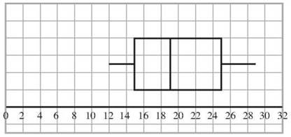
One of the ways in which quartiles are used is in the creation of a graph called a box and whisker plot, or a boxplot. It gets its name from its appearance. It’s a box with a line poking out on each side, like a whisker. The whiskers reach to the lowest and the highest numbers in the data set, but the box shows the quartiles.
You have the data above on number of books read, and you know that Q1 = 15, the median is 19 and Q3 = 25. Notice that the smallest value is 12 and the largest is 29. Draw a scale and mark it to show at least 12 to 29. Draw a rectangle that reaches from 15 to 25. That’s the box part of the box plot. From the lower end of the box, draw a line, a whisker, down to the minimum of 12. From the upper end, draw a whisker to the maximum of 29. Finally, add a divider to the rectangle at 19 to show where the median is.

CHECK POINT
In questions 16-18, find the first quartile, median, and third quartile of each data set.
16. A = {3, 4, 5, 4, 7, 8, 9, 2, 10, 17, 32, 34, 36, 38}
17. B = {2, 2, 3, 3, 4, 4, 4, 34, 54, 78, 92, 101}
18. C = {22, 83, 21, 49, 76, 64, 83, 29, 94, 19, 82, 28, 101}
19. George and Harry take the same test. George’s score places him at the 54th percentile, and Harry’s score is at the 43rd percentile. Who did better?
20. Draw a box plot for data set A in question 16.