THE LIVING WORLD
0. Studying Biology
0.4. How to Read a Graph
Variables and Graphs
In the previous section, you encountered four graphs illustrating what happened to variables, such as global temperature, when other variables, like atmospheric carbon dioxide, change. A variable, as its name implies, is something that can change. Variables are the tools of science, and you will encounter many different kinds as you proceed through this text. Many of the variables biologists study are examined in graphs like you saw on the previous pages. A graph shows what happens to one variable when another one changes.
There are two types of variables. The first kind, an independent variable, is one that a researcher deliberately changes—for example, the concentration of a chemical in a solution, or the number of cigarettes smoked per day. The second kind, a dependent variable, is what happens in response to the changes in the independent variable—for example, the intensity of a solution’s color, or the incidence of lung cancer. Importantly, the change in a dependent variable that is measured in an experiment is not predetermined by the investigator.
In science, all graphs are presented in a consistent way. The independent variable is always presented and labeled across the bottom, called the x axis. The dependent variable is always presented and labeled along the side (usually the left side), called the y axis (figure 0.10).
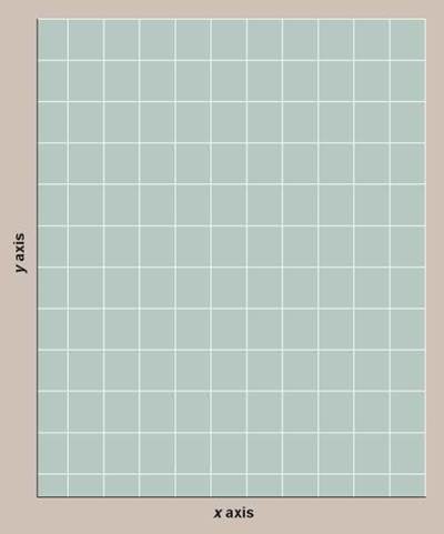
Figure 0.10. The two axes of a graph.
The independent variable is almost always presented along the x axis, and the dependent variable is usually shown along the y axis.
Some research involves examining correlations between sets of variables, rather than the deliberate manipulation of a variable. For example, a researcher who measures both diabetes and obesity levels (as described in the previous section) is actually comparing two dependent variables. While such a comparison can reveal correlations and so suggest potential relationships, correlation does not prove causation. What is happening to one variable may actually have nothing to do with what happens to the other variable. Only by manipulating a variable (making it an independent variable) can you test for causality. Just because people that are obese tend to also have diabetes does not establish that obesity causes diabetes. Other experiments are needed to determine causation.
Using the Appropriate Scale and Units
A key aspect of presenting data in a graph is the selection of proper scale. Data presented in a table can utilize many scales, from seconds to centuries, with no problems. A graph, however, typically has a single scale on the x axis and a single scale on the y axis, which might consist of microscopic units (for example, nanometers, microliters, micrograms) or macroscopic units (for example, feet, inches, liters, days, milligrams). In each instance, a scale must be chosen that fits what is being measured. Changes in centimeters would not be obvious in a graph scaled in kilometers. Also, if a variable changes a great deal over the course of the experiment, it is often useful to use an expanding scale. A log or logarithmic scale is a series of numbers plotted as powers of 10 (1, 10, 100, 1,000,...) rather than in the linear progression seen on most graphs (2,000, 4,000, 6,000...). Consider the two graphs in figure 0.11, where the y axis is plotted on a linear scale on the left and on a log scale on the right. You can see that the log scale more clearly displays changes in the dependent variable (the y axis) for the upper values of the independent variable (the x axis, values 2, 3, and 4). Notice that the interval between each y axis number is not linear either—the interval between each number is itself subdivided on a log scale. Thus, 50 (the fourth tick mark between 10 and 100) is plotted much closer to 100 than to 10.
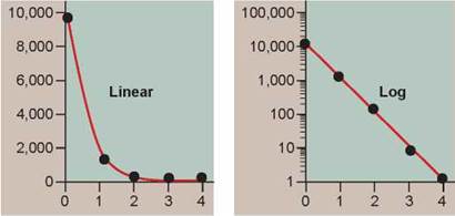
Figure 0.11. Linear and log scale: two ways of presenting the same data.
Individual graphs use different units of measurement, each chosen to best display the experimental data. By international convention, scientific data are presented in metric units, a system of units expressed as powers of 10. For example, weight is expressed in units called grams. Ten grams make up a decagram, and 1,000 grams is a kilogram. Smaller weights are expressed as a portion of a gram—for example, a centigram is a hundredth of a gram, and a milligram is a thousandth of a gram. The units of measurement employed in a graph are by convention indicated in parentheses next to the independent variable label on the x axis and the dependent variable label on the y axis.
Drawing a Line
Most of the graphs that you will find in this text are line graphs, which are graphs composed of data points and one or more lines. Line graphs are typically used to present continuous data—that is, data that are discrete samples of a continuous process. An example might be data measuring how quickly the ozone hole develops over Antarctica in August and September of each year. You could in principle measure the area of the ozone hole every day, but to make the project more manageable in time and resources, you might actually take a measurement only once a week. Measurements reveal that the ozone hole increases in area rapidly for about six weeks before shrinking, yielding six data points during its expansion. These six data points are like individual frames from a movie—frozen moments in time. The six data points might indicate a very consistent pattern, or they might not.
Consider the hypothetical data in the graphs of figure 0.12. The data points on the left graph are changing in a very consistent way, with little variation from what a straight line (drawn in red) would predict. The graph in the middle shows more experimental variation, but a straight line still does a good job of revealing the overall pattern of how the data are changing. Such a straight “best-fit line” is called a regression line and is calculated by estimating the distance of each point to possible lines, adding the values, and selecting the line with the lowest sum. The data points in the graph on the right are randomly distributed and show no overall pattern, indicating that there is no relationship between the dependent and the independent variables.
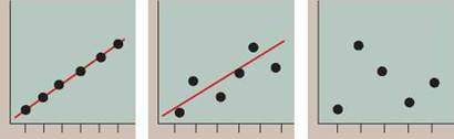
Figure 0.12. Line graphs: hypothetical growth in size of the ozone hole.
Other Graphical Presentations of Data
Sometimes the independent variable for a data set is not continuous but rather represents discrete sets of data. A line graph, with its assumption of continuity, cannot accurately represent the variation occurring in discrete sets of data, where the data sets are being compared with one another. In these cases, the preferred presentation is that of a histogram, a kind of bar graph. For example, if you were surveying the heights of pine trees in a park, you might group their heights (the independent variable) into discrete “categories” such as 0 to 5 meters tall, 5 to 10 meters, and so on. These categories are placed on the x axis. You would then count the number of trees in each category and present that dependent variable on the y axis, as shown in figure 0.13.
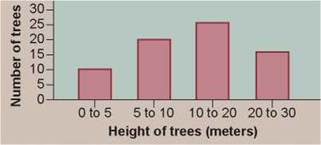
Figure 0.13. Histogram: the frequency of tall trees.
Some data represent proportions of a whole data set, for example the different types of trees in the park as a percentage of all the trees. This type of data is often presented in a pie chart (figure 0.14).
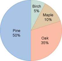
Figure 0.14. Pie chart: the composition of a forest.
Putting Your Graph-Reading Skills to Work: Inquiry & Analysis
The sorts of graphs you have encountered here in this brief introduction are all used frequently by scientists in analyzing and presenting their experimental results, and you will encounter them often as you proceed through this text.
Learning to read a graph and understanding what it does and does not tell you is one of the most important things you can take away from a biology course. To help you develop this skill, every chapter of this text ends with a full-page Inquiry & Analysis feature. Each of these end-of-chapter features describes a real scientific investigation. You will be introduced to a question, and then given a hypothesis posed by a researcher (a hypothesis is a kind of explanation) to answer that question. The feature will then tell you how the researcher set about evaluating his or her hypothesis with an experiment and will present a graph of the data the researcher obtained. You are then challenged to analyze the data and reach a conclusion about the validity of the hypothesis.
As an example, consider research on the ozone hole, also discussed further in chapter 1. What sort of graph might you expect to see? A line graph can be used to present data on how the size of the ozone hole changes over the course of one year. Because the dependent variable is the size of the ozone hole measured continuously over a single season, a smooth curve accurately portrays what is actually going on. In this case, the regression line is not a straight line, but rather a curve (figure 0.15).
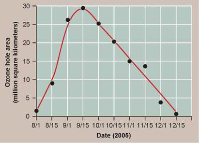
Figure 0.15. Changes in the size of the ozone hole over one year.
This graph shows how the size of the ozone hole changes over time, first expanding in size and then getting smaller.
Can line graphs and histograms be used to present the same data? In some cases, yes. The mode of its presentation does not alter the data; it only serves to emphasize the point being investigated. The histogram in figure 0.16 presents data on how the peak size of the ozone hole has changed in two-year intervals over the past 26 years. However, this same data could also have been presented as a line graph—as it was in figure 0.9.
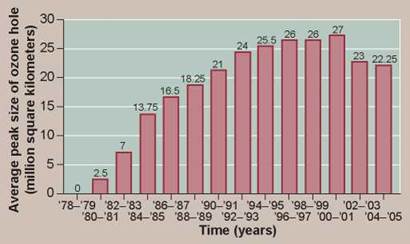
Figure 0.16. The peak sizes of the ozone hole.
This histogram shows how the size of the ozone hole increased in size (determined by its peak size) for 20 years before it then started to decrease.
Presented with a graph of the data obtained in the investigation of the Inquiry & Analysis, it will be your job to analyze it. Every analysis of a graph involves four distinct steps, some more complex than others but all essential to the process.
Applying Concepts. Your first task is to make sure you understand the nature of the variables, and the scale at which they are being presented in the graph. As a selftest, it is always a good idea to ask yourself to identify the dependent variable.
Interpreting Data. Look at the graph. What is changing? How much? How quickly? Is the change continuous? Progressive? What in fact has happened?
Making Inferences. Looking at what has happened, can you logically infer that the independent variable has caused the change you see in the dependent variable?
Drawing Conclusions. Does the inference you were able to make support the hypothesis that the experiment set out to test?
This process of inquiry and analysis is the nuts and bolts of science, and by mastering it, you will go a long way toward learning how a scientist thinks. Long after this course is completed, you will find yourself compelled to make judgements about competing scientific claims you encounter as a citizen: Should the Government ban the chemical BPA from plastic bottles? Should you vote in favor of caps on factory carbon emissions? Are swine flu immunizations better delivered as nasal squirts (which use live flu viruses) or shots (which use dead flu viruses)? Few pages in this text provide more bang for the buck in learning that lasts.
Key Learning Outcome 0.4. Scientists often present data in standardized graphs, which portray how a dependent variable changes when an independent variable is changed.