High School Algebra II Unlocked (2016)
Chapter 8. Inferences and Conclusions from Data
Lesson 8.4. Probability Distributions
REVIEW
The median of a set of data is the middle element, or the mean of the middle two elements for an even number of elements, when all elements in the set are arranged from least to greatest.
A skewed distribution is a data distribution that is asymmetrical, with more data toward one end than toward the other. As a distribution curve, it has a longer “tail” on one end than the other, in contrast with a normal distribution, where the curve is symmetrical.
A uniform distribution is a data distribution that is completely uniform, where all data values are equal. As a distribution curve, it is a straight horizontal line.
The area of a square of side length s is given by the formula A = s2.
The area of a triangle of base b and height h is given by the formula A = 1/2 bh.
The area of a rectangle of length l and width w is given by the formula A = lw.
A probability distribution graph shows the probabilities of obtaining various values (outcomes) within that set.
DISCRETE PROBABILITY DISTRIBUTIONS
When the sample space (the set of possible outcomes) is made up of individual, countable outcomes, the probability distribution is a set of points: a discrete probability distribution. In the case of a coin toss, where there are only two possible outcomes, the probability distribution is two points: the probability of an outcome of heads and the probability of an outcome of tails.
We may want to assign values (numbers) to outcomes rather than giving them descriptive labels (Heads and Tails, for example), for a probability distribution graph. For the act of tossing a coin once, we can define the number 0 to represent an outcome of tails and the number 1 to represent an outcome of heads. Each outcome has a theoretical probability of 0.5. Here’s a graph relating the outcome value to its probability.
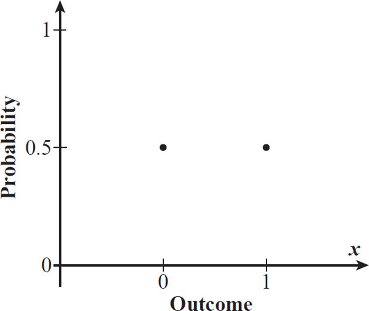
The graph consists of only two points, because there are only two possible outcomes for the coin toss: 0 (tails) and 1 (heads). The two points are at the same level, because they have the same probability: 0.5. This is an example of adiscrete uniform distribution, a type of probability distribution in which the outcomes are discrete (separate, individual) events and the probability is uniformly distributed (meaning that each outcome has an equal probability).
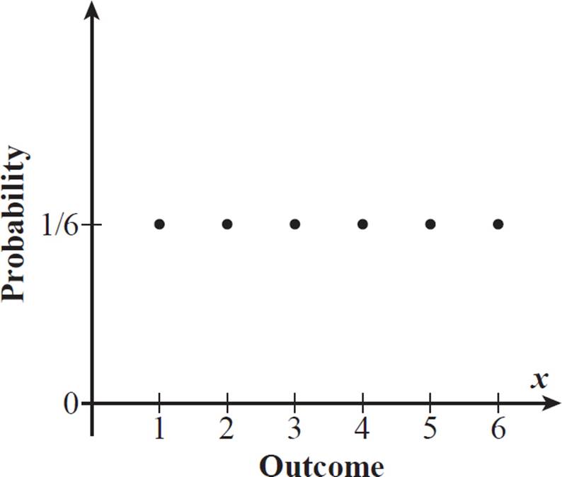
Another example of a discrete uniform distribution is the probability distribution for a toss of a fair die. The probability is the same (1/6) for each of the 6 possible outcomes (rolling 1, 2, 3, 4, 5, or 6).
The discrete uniform
distribution for the coin
toss is a representation
of theoretical
probabilities, not
experimental
probabilities, of
the two possible
outcomes. Uniform
distributions typically
reflect theoretical
probabilities, because
experimental
probabilities do not
usually produce exact
uniform probability
distribution.
The horizontal axis, labeled here as Outcome, or x, is the random variable axis. A random variable represents any of a set of possible values for outcomes of an experiment, or results of a survey or observational study.

If an experiment has exactly n different, equally likely individual results, then what will its probability distribution look like?
The outcomes are distinct individual results that are equally likely, so the distribution is a discrete uniform distribution. Because there are exactly n possible outcomes, each equally likely, the probability of any one of those outcomes is 1/n. The discrete uniform distribution for this experiment would be a series of n points for random variable integer values 1 through n, each at a height of 1/n on the probability axis.

Random number generators also use uniform distribution. Typically, a random number generator generates numbers on the (0, 1) interval, each with an equal probability. So, for example, it might break the 1-unit interval into thousandths, assigning each value (0.001, 0.002, and so on) an equal probability, to generate from a group of 1000 distinct numbers.
CONTINUOUS PROBABILITY DISTRIBUTIONS
While a discrete probability sample space contains a countable number of values, a continuous probability sample space contains a range of values, which means it includes the infinite number of points that are within that range.
For an infinite number of possible outcomes, there is an infinite number of probability values associated with them. While the probability distribution graph for a discrete probability distribution is a set of points, the probability distribution graph for a continuous probability distribution is a continuous curve.
In a continuous uniform distribution, there is equal probability over a given range of values. The sample space range may represent, for example, a range of lengths or areas, each of which would include an infinite number of points.

For example, consider
the grape weight data
at the beginning of
Lesson 8.3. The full set
of possible individual
grape weights is a
continuous distribution
of values, with an
infinite number of
possible values
within that range.
The range of grape
weights includes an
infinite number of
possibilities because
the grape weights
can be, theoretically,
measured to infinity
decimal places.

What is the probability that a randomly chosen point within square QRST lies within the shaded triangle QVT, as shown below?
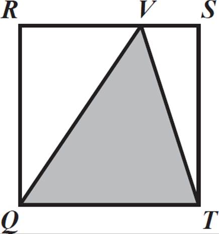
Because all points within QRST are equally likely to be chosen (randomly), the probability that the chosen point is in triangle QVT is the same for all of them. This means that the probability distribution of being in QVT, for the set of randomly chosen points from the square, is a continuous uniform distribution.
There are an infinite number of points in the square and an infinite number of points in the triangle. We must therefore use the ratio of the areas of these two shapes to determine the probability.
Let s = the side length of square QRST. The area of QRST is equal to s2. Triangle QVT has a base that is the same length as one side of the square, s, and a height (perpendicular to that base) of the same height as the square, s. The area of triangle QVT is 1/2 ⋅ s ⋅ s, or 1/2 s2.
The ratio of the area of shaded triangle QVT to the area of the entire square QRST is 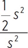 , which simplifies to 1/2. The probability that a randomly chosen point within square QRST will lie within triangle QVT is 1/2, or 0.5. If the infinite number of points withinQRST were assigned individual values and one of those values were chosen at random, its probability of corresponding to a point within the triangle would be 0.5.

A range of times also constitutes a continuous sample space with an infinite number of values. If a woman arrives at a certain location at any time (randomly chosen) within a 14-minute range, the probability of her arriving at a specific given time depends on the units in which we break up the time range. For example, there are 14 minutes in the set of possible outcomes, so the probability that she will arrive at any given minute (such as at minute 1, meaning within just the first minute) is 1/14. However, because there are 14 ⋅ 60 = 840 seconds in 14 minutes, the probability that she will arrive at any given second within the 14-minute range is 1/840.
These two probability distributions for the woman’s arrival time are both discrete uniform probability distributions. A graph would be a series of 14 points at a probability level of 1/14 for the first approach and a series of 840 points at a probability level of 1/840 for the second approach. But, the actual range of possible arrival times is infinite, matching a continuous uniform probability distribution. We could draw a horizontal line segment to represent the uniform probability for all points in the continuous sample space, but at what level would we draw it?
Instead of using the above approach, with probability on the vertical axis, statisticians instead use the area under a curve to represent the cumulative probabilities for a continuous probability distribution. The total area for the entire sample space must be 1, representing 100%, because all possible outcomes must fall within the sample space range. We were given the fact that the woman arrives sometime within the 14-minute range, so there is a 100% probability that she will arrive somewhere between x = 0 and x = 14 on the random variable axis. There is 0% probability that she will arrive before 0 or after 14 minutes (x < 0 or x > 14). The curve (which in the case of a uniform distribution is a straight line segment) is defined by a probability density function.
In mathematics, we
use the term “curve”
to mean any sort of
curved or straight
line—“line” in the
everyday sense of
the word, that is. We
use the term “line”
only to represent
a straight line.
The probability density function of a continuous uniform distribution with a sample space (random variable) with minimum a and maximum b is given by:
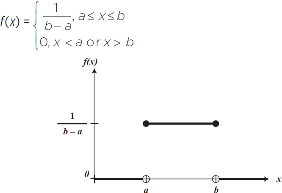
The continuous uniform distribution, shown in the graph above, is also called the rectangular distribution, because the probability is the area under the curve and above 0: a rectangle when the probability density function is horizontal. Probabilities are given for ranges of x-values rather than for individual x-values. However, the results are the same as if we used discrete probability graphs for calculations, with the benefit of only having to use one probability distribution graph for any range of x-values chosen.
For example, let’s look again at the probability distribution for a woman arriving any time within a 14-minute range. Our random variable parameters are a = 0 and b = 14, so the probability function is f(x) = 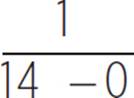 , or f(x) = 1/14, for 0 ≤ x≤ 14, and f(x) = 0 for x < 0 or x > 14. Probability distributions often use decimal values for the vertical axis, so let’s convert 1/14 to a decimal: 0.0714. Here is the probability density function for this situation.
Remember, the
function curve is
just the boundary
line for the area
underneath, which
is what represents
the probability. The
function value along
the curve does not
give the individual
probabilities for values
in the sample space.
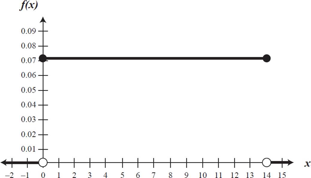
The probability is the area under the curve for the given random variable range. For an arrival time between x = 0 and x = 1 (or any other one-minute time interval), the probability is the area under f(x) = 0.0714 between those two points. This is a rectangle with length 0.0714 and width 1, so the area is 0.0714. This reflects what we found earlier: the probability of the woman arriving within any one-minute period is 1/14, or 0.0714.
The probability that the woman arrives within any given one-second interval is equal to the area under the curve for a one-second width. The x-values on the graph are in terms of minutes, so we must convert one second to minutes. One second is 1/60 minute, or 0.16 minute. The area under f(x) = 0.0714 for a width of 0.16 is equal to 0.0714 ⋅ 0.16 = 0.0119. This is equivalent to 1/840, the probability we found earlier.

A 14-minute fountain show continuously repeats, cycling through a 4-minute pop song, a 3-minute excerpt from an opera, a 3-minute Broadway show tune, and a 4-minute classic rock song. If Hailey arrives at some random point in the cycle and watches for 5 minutes, what is the probability that she will not see the opera excerpt?
First, let’s determine the sample space. In this situation, the sample space is the 14-minute period of time that encompasses one full cycle of the fountain show, because Hailey could arrive at any point in that 14-minute interval. This is a continuous random variable interval.
The “desired” outcome for the probability is Hailey staying for 5 minutes and not seeing the opera excerpt. We must find what range of times, out of the 14-minute interval, fits this description. If Hailey arrives at any point during the 3-minute opera piece, she sees at least some of it. Also, if she arrives less than 5 minutes before the opera piece starts, she sees some portion of it, because she is staying for 5 minutes. So, in total, there are 3 + 5 = 8 minutes out of the cycle with arrival times resulting in Hailey seeing the opera piece.
The arrival points that result in Hailey not seeing the opera piece are along the interval of the remaining 14 − 8 = 6 minutes. So, the probability that Hailey will not see the opera excerpt is 6/14, simplified as 3/7, or about 0.43.
If we are being precise,
the number of minutes
is less than 8, but for
the purposes of this
situation, rounding
off is fine, especially
because the “arrival”
time will not be
precisely measured
to a second. Hailey
might also see a few
seconds of the opera
piece as she’s walking
up to the fountain,
before “arriving.”

Now, let’s perform the calculation using the probability distribution graph (and the probability distribution function). The area under the function f(x) = 0.0714 for a time range of 6 minutes is 0.0714 ⋅ 6 ≈ 0.43.
See the histogram
of grape weights
at the beginning
of Lesson 8.3.
Not all data frequency distributions are uniform, as we saw in the case of grape weights, so not all continuous probability distributions are uniform. If the researcher recorded the individual grape weights instead of categorizing them by intervals, then she would have a set of 10,000 data points. With a very large number of data points, a graph of frequencies of weights would start to resemble a bell-shaped curve. The probability distribution for the outcomes (grape weights) would also resemble a curve, of the same basic shape. A probability density curve for all grape weights (of this variety of grape) may look like the one below.
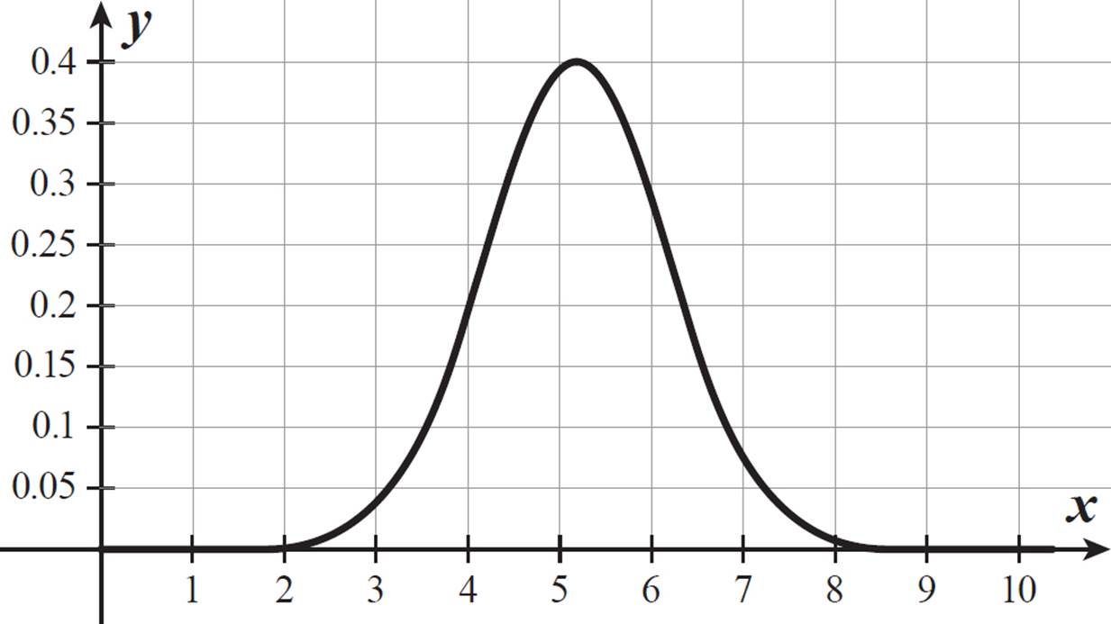
Remember, you cannot read the probability off the y-axis. The probability of a range of x-values is the area under the curve. This curve is symmetrical, so the area under the left half of the curve is equal to the area under the right half of the curve. The midpoint of the curve occurs at x = 5.2. The total area under the curve is 1, so the area under the curve in either half is 0.5. This means there is a 50% chance that a grape of this variety weighs less than 5.2 grams and a 50% chance that a grape of this variety weighs more than 5.2 grams. For a sample data set matching this curve, that would mean about half the grapes weigh less than 5.2 grams and about half the grapes weigh more.
Normal Distribution
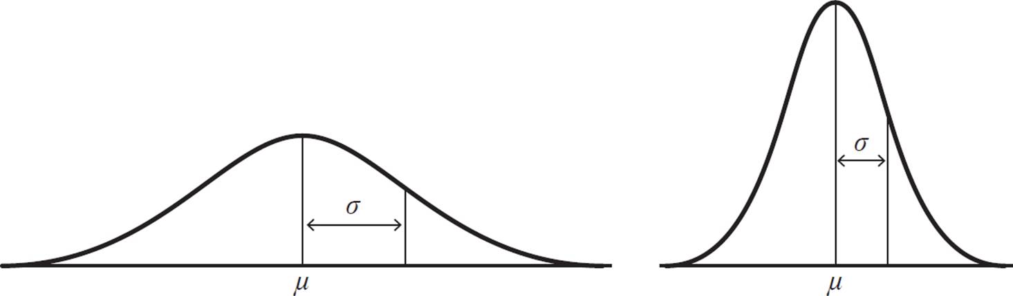
Probability distribution curves can take many different shapes, but one of the most common ones is the normal distribution. Many biological measurements, such as grape weights or human heights, approximate a normal distribution curve. A normal distribution curve is a type of continuous probability distribution, and its probability density function graph is a symmetrical, bell-shaped curve. Because of its symmetry, the mean and median of the values lie at the same point, aligned with the center of the curve. Half of all values are less than the mean, and half of all values are greater than the mean.
The points of inflection of the curve each lie one standard deviation (σ) from the mean (μ). A data set that is normally distributed but with greater variability is a flatter curve, with a larger σ. A data set that is normally distributed but with less variability is a taller curve that falls off more quickly on either side, with a smaller σ.
The area under each curve is equal to 1. So, a curve with a larger σ will be lower, while a curve with a smaller σ will be higher, to maintain that area.
We have seen points
of inflection in tangent
functions in Lesson
4.4 and in cube root
functions in Lesson
6.1. Here, the points
of inflection of the bell
curve are meaningful
as locations one
standard deviation
away from the mean.
The great thing about normal distributions is that the areas of sections under their curves are known for any given distance from the mean, in terms of standard deviations. If you know the mean and a standard deviation for a normal distribution, you can graph the distribution curve, and you can also calculate the probability for any range of random variable values.
Here are some highlights of the normal distribution relationship:
• About 68% of all observed values are within one standard deviation (1σ) of the mean.
• About 95% of all observed values are within two standard deviations (2σ) of the mean.
• About 99.7% of all observed values are within three standard deviations (3σ) of the mean.
Because the normal distribution curve is symmetric with respect to the mean, these percentages can be divided in half when measuring in one direction from the mean: 34% of all observed values are within σ to the right of the mean, 47.5% are within 2σ to the right of the mean, and 49.85% are within 3σ to the right of the mean. And, it is the same for percentages within 1, 2, and 3 standard deviations to the left of the mean.
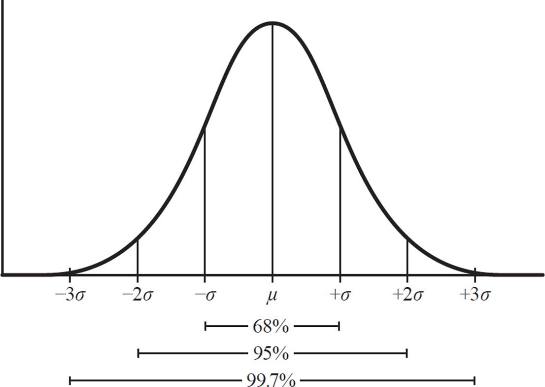
This graph indicates
the number of
standard deviations
to the left and right
of the mean. The
x-value of the point
that is labeled as −σ
here would actually be
μ − σ. The point that
is +2σ to the right of
the mean would have
an x-value of μ + 2σ.

Alexei received a score of 79 on his biology test. He finds out that, for all the students who took that particular biology test, the scores are normally distributed, with a mean score of 70 and a standard deviation of 4. What does that tell him about his test performance in comparison to other students who took the test?
The mean test score (μ) is 70, and the standard deviation (σ) is 4. About 68% of test scores are within one σ, or 4 points, of the mean, 70. So, 68% of students scored between 70 − 4 = 66 and 70 + 4 = 74 on the test.
About 95% of test scores are within two standard deviations, or 8 points, of the mean, so 95% of students scored between 62 and 78 on the test. Alexei’s score of 79 is better than the scores of those 95%. Also, because the normal distribution curve is symmetrical, the number of students who scored higher than 78 is the same as the number of students who scored lower than 62. Together, they account for 5% of students who took this test (100% − 95%), so the percentage of students who scored higher than 78 is 1/2 (5%), or 2.5%. This means that Alexei’s score is in the top 2.5% of test scores. In other words, he scored higher than 97.5% of students who took that biology test. (He is in the 97.5 percentile.)
This sort of conclusion
is only valid if there
is a sufficiently large
population. If the mean
and standard deviation
are for a class of 25
students, the data
may not match up
very well with the
normal distribution
curve. However, if this
particular biology test
has been taken by
thousands of students,
our conclusion is
relatively accurate.


According to historical data, the mean of high temperatures for June 18 in a certain town is 94.5° F, with a standard deviation of 4.5° F. Assuming the data is normally distributed, what is the probability that the temperature in this town will reach a high of at least 90° F next June 18?
The temperature 90° F is 4.5° F less than the mean, 94.5° F, so it is one standard deviation below the mean. The probability of a temperature 90° F or higher is the area under the normal distribution curve from 90° F to the right.
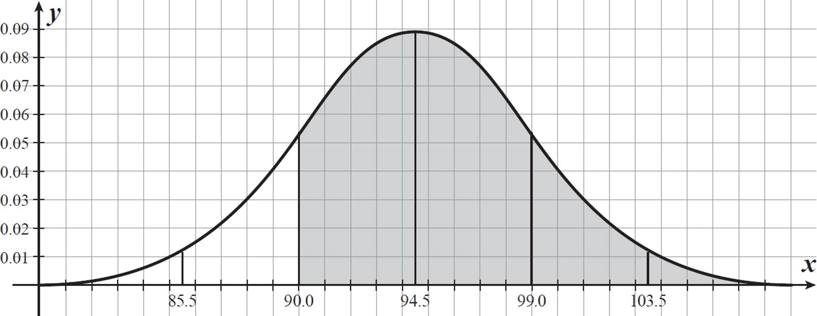
We know that the area to the right of 94.5 contains 50% of the data. The area within one σ on either side of center contains 68% of the data, so the area between 90.0 and 94.5 contains 1/2 (68%) = 34% of the data. The area to the right of 90.0 contains 34% + 50% = 84%, or 0.84. There is an 84% chance that it will reach a high of at least 90° F in this town next June 18.


Use the term
“percentage points”
when you are talking
about a difference
between percentages.
Otherwise, saying
something like, “a
mean of 21.4% and
a standard deviation
of 2.8%” might be
interpreted as meaning
that the standard
deviation is 2.8%
of 21.4%, which is
not the case here.
Chris’s body fat percentage is 17.0%. Suppose that body fat percentages for men of Chris’s age are normally distributed with a mean of 21.4% and a standard deviation of 2.8 percentage points. What does this tell you about where Chris ranks in body fat percentage among men his age?
Chris’s body fat percentage is below the mean. We must determine how many standard deviations it is from the mean. In this case, it is not a whole number of standard deviations. First, find the absolute difference in body fat percentage between the mean and Chris’s.
21.4 − 17.0 = 4.4
Chris’s body fat percentage is 4.4 percentage points less than the mean. Divide this difference by the standard deviation.
4.4/2.8 = 1.57
Chris’s body fat percentage is 1.57 standard deviations below the mean. We know that the area to the left of the mean contains 50% of the population and the area between the mean and one standard deviation away contains 34% of the population, so the area to the left of the point (μ − σ) contains 0.5 − 0.34 = 0.16.
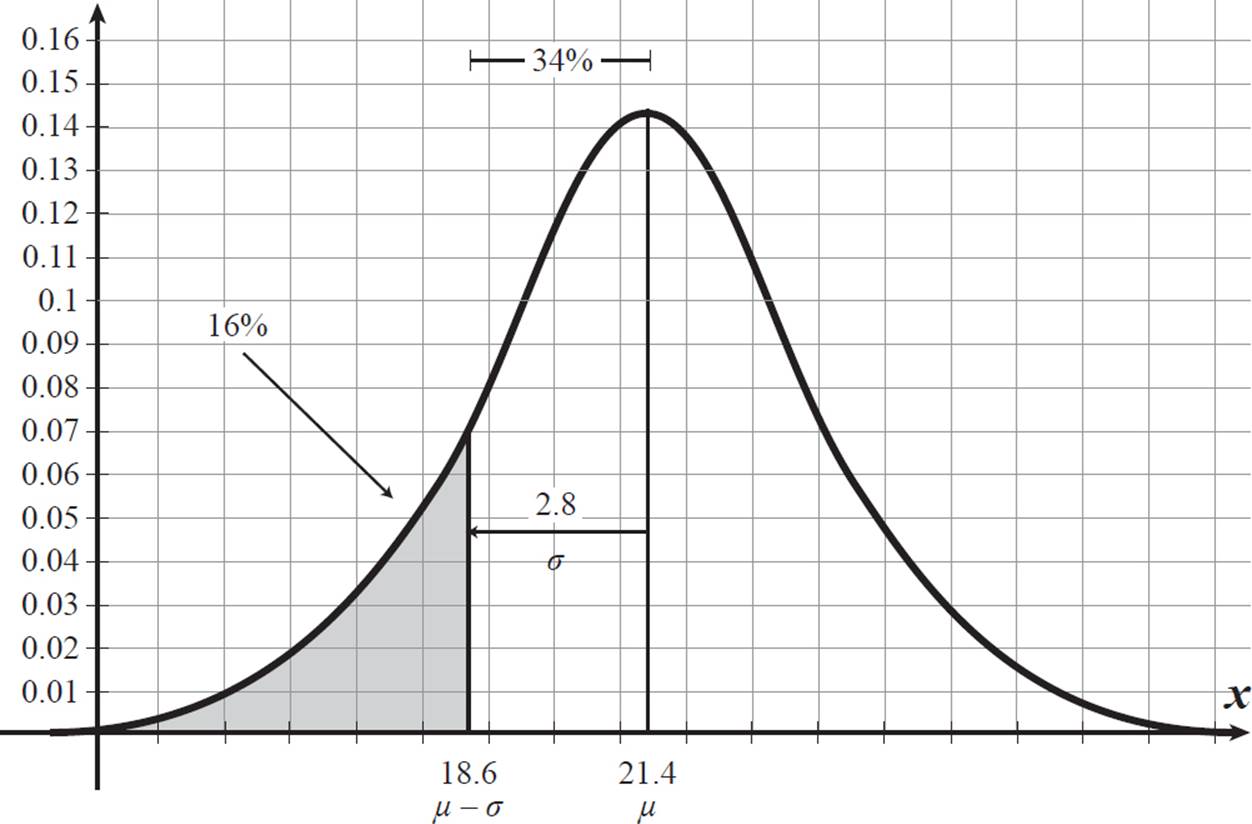
We could also
calculate this area
as half (because of
symmetry) of the area
not included in the 68%
within 1σ of the mean: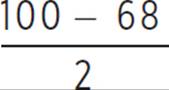 = 16.
= 16.
We also know that the area to the left of two standard deviations from the mean contains half of (100 − 95)% of the data (with the other half of that in the right-hand tail).
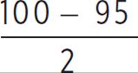 = 2.5
= 2.5
Chris’s body fat percentage is between these two, so he is in the bottom 16% of all men his age, but not in the bottom 2.5%, by body fat percentage.

It is possible to calculate the percentile more precisely, using the z-score, which is the number of standard deviations an element is from the mean. Here, Chris’s z-score is −1.57. Below is an excerpt from a standard normal table, which gives area under the curve to the left of the given z-score.
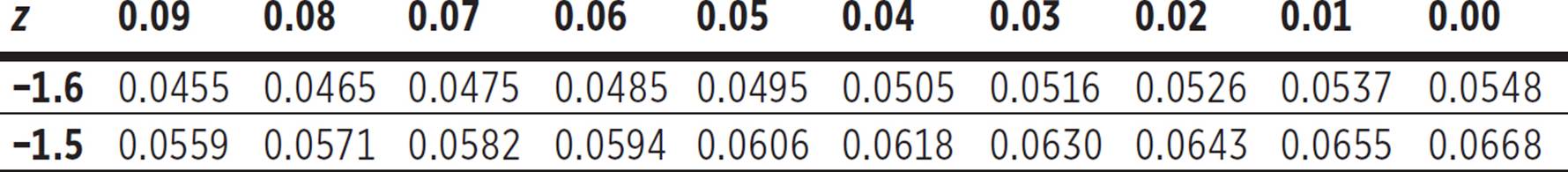
Find −1.5 in the left column and then 0.07 in the top row, to represent the total z-score of −1.57. The box where that row and column intersect shows the number 0.0582. This represents the area under the normal curve, to the left of a z-score of −1.57. To convert to a percent, multiply by 100. This tells us that Chris’s body fat percentage is in the 5.8 percentile for men his age. In other words, 5.8% of men his age have a lower body fat percentage than Chris.

Kuan-Ni is a piano teacher. She has recorded the number of hours per day she has taught for the past few years. Using statistical analysis on her spreadsheet, she found that, on 95% of her work days, she taught between 2.0 and 8.4 hours per day. What is likely the mean number of hours she taught per day? What is likely the standard deviation for the data set of hours per day? What underlying assumption produces the above answers, and could it be wrong?
For a normal distribution, 95% of all data lie within two standard deviations up and down from the mean. If 2.0 is two σ below the mean and 8.4 is two σ above the mean, then the mean is exactly between 2.0 and 8.4.
μ = 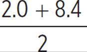 = 5.2
= 5.2
There is a distance of four standard deviations from 2.0 to 8.4. Divide the difference by 4 to solve for σ.
σ = 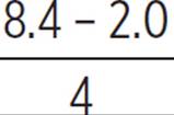 = 1.6
= 1.6
So, Kuan-Ni taught an average (mean) of 5.2 hours per day, with a standard deviation of 1.6 hours for her daily teaching hours data.
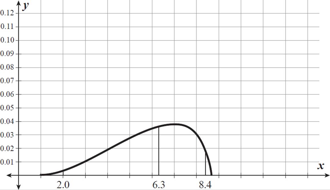
To produce these answers, we assumed that Kuan-Ni’s set of daily teaching hours is normally distributed. This may not be true. For example, even though 95% of her teaching days include 2.0 to 8.4 hours per day, her mean could be 6.3 hours per day, with her median even higher. The distribution could be skewed left, as shown below.


As part of their marketing campaign, a store sent out E-mails containing coupons to all 1800 people on their mailing list. For each group of 100 E-mail addresses, they used a computer program to randomly sort the addresses into two groups of 50 addresses each. To the addresses in Group A, they sent a “buy one, get one 1/2 off” coupon, which gives the customer a 50% discount on one item with the purchase of another item at full price. To the addresses in Group B, they sent a “25% off” coupon, which gives the customer a 25% discount off the total price of up to two items. The company tracked the number of coupons of each kind used by members of each group of 50, as shown below.
“Buy one, get one 1/2 off” coupon:
{ 9, 10, 10, 11, 11, 11, 12, 12, 12, 12, 12, 12, 12, 13, 13, 14, 15, 15}
“25% off” coupon:
{17, 17, 18, 18, 18, 19, 19, 19, 19, 19, 19, 19, 19, 20, 20, 20, 20, 22}
It seems that the
marketing department
wants to determine
which wording has
a greater effect on
customers. Each
of these coupons
results in a maximum
discount of 25% on a
purchase of two items.
(a) Which of the two coupons seems to result in more customers using the coupon? Use the means and standard deviations of the two sets to explain your answer.
(b) The marketing department combined the results for each group of 100 mailings and randomly divided each into a group of 50, then determined the number of coupons (either kind) used within that group. They calculated the mean number of coupons used per 50 customers receiving either of the E-mails, as well as the standard deviation for this combined set of data. They used a computer software program that generates random numbers according to a normal distribution, with the mean number of coupons (either type) used per 50 customers, and the standard deviation for that set. In five simulations, they got the following data sets.
{11, 13, 14, 15, 15, 15, 15, 16, 16, 17, 17, 18, 20, 20, 21, 21, 23, 23}
{5, 5, 11, 12, 13, 13, 14, 14, 15, 16, 16, 16, 16, 17, 19, 19, 24, 24}
{11, 12, 12, 13, 14, 14, 15, 18, 18, 18, 18, 19, 19, 19, 19, 19, 20, 21}
{9, 9, 9, 10, 10, 11, 12, 13, 13, 13, 14, 14, 15, 16, 17, 18, 18, 22}
{7, 8, 9, 10, 14, 14, 14, 14, 14, 15, 15, 15, 16, 16, 16, 17, 20, 22}
According to this data, how likely is it that the “25% off” coupon results are due to randomness in how the treatment sets were assigned? What are possible explanations for the difference in the numbers of coupons used?
The “25% off” coupon seems to result in more customers using the coupon. The mean coupons used (per 50-address mailing) is 19 for this set, as compared with a mean of 12 coupons used for the “buy one, get one 1/2 off” set. The variability is pretty low for each set (1.6 for the “buy one, get one 1/2 off” group and 1.2 for the “25% off” group), which means that data is pretty consistent within each set, and there is no overlap between the sets.
None of the simulation sets seems very similar to either of the single-coupon-variety data sets. The third simulation set has somewhat similar numbers, in terms of the median and the upper half of the data, to the “25% off” coupon data set, but the range is much greater, and the standard deviation is much greater (3.2, as compared to 1.2).
It seems very unlikely that the greater use of the “25% off” coupons is due to randomness in how the treatment sets were assigned. One possibility is that “25% off” sounds like a better discount to customers than “buy one, get one 1/2 off.” Another possibility is that the difference is due to some customers using the “25% off” coupon to purchase just one item, whereas they would not have used it to purchase two items. This study did not take this factor into account.
