Basic Math and Pre-Algebra
PART 4. The State of the World
CHAPTER 19. Graphs
Circle Graph
Circle graphs, sometimes called pie charts, are visual aids that show a circle broken into wedges, in much the way you would slice a pie or cake.
When to Use It
Circle graphs are used to represent quantities as fractions of a whole. When you have several numbers that all combine to make up one thing, a circle graph may be a good way to show that. If you know that you have 8 seniors, 5 juniors, and 2 sophomores on your team, you might use a circle to represent the team, broken into three wedges. The size of each wedge corresponds to the fraction of the team that comes from each class.
MATH TRAP
Information given in percentages doesn't automatically go in a circle graph. A circle graph could show the percentages of the Town Council who come from each political party, but it can't show the percentage of Republicans in the Town Council compared to the percentage of Republicans in the state legislature. The percentages have to be parts of the same whole.
How to Draw It
Drawing a circle graph seems easy. Make a circle, add a few lines to split it up, and attach a few labels. That will make a circle graph, but if you want a good circle graph, a really accurate circle graph, it takes a bit more work.
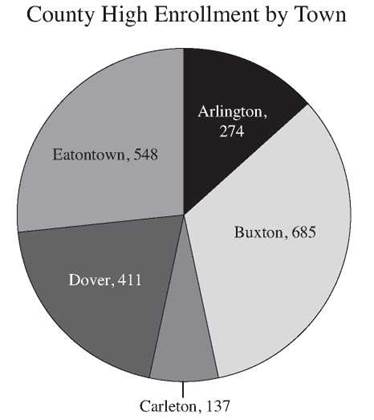
Suppose County High School made a list of how many of its students came from each of the towns in the county. Here’s what they found out.
Home Towns of County High Students
Town |
Number of Students |
Arlington |
274 |
Buxton |
685 |
Carleton |
137 |
Dover |
411 |
Eatontown |
548 |
To make an accurate circle graph, you first need to know what fraction of the high school enrollment comes from each town. To find that out, total up all the students, and divide the number from each town by the total of 2,055. Simplify the fractions.
Home Towns of County High Students
Town |
Number of Students |
Fraction of the School |
Arlington |
274 |
274/2055 = 2/15 |
Buxton |
685 |
685/2055 = 1/3 |
Carleton |
137 |
137/2055 = 1/15 |
Dover |
411 |
411/2055 = 1/5 |
Eatontown |
548 |
548/2055 = 4/15 |
Each town is going to be represented by a wedge of the circle, and the size of that wedge should be the same fraction of the circle. To make sure it’s right, you need to find the number of degrees for each fraction of the circle and then get a protractor to measure the angles correctly. (Computer software can do a lot of the work for you, but it’s good to know how to do it by hand.) Multiply the fraction of the school times 360 to find the number of degrees in each wedge, and then carefully divide the circle, using a protractor.
Home Towns of County High Students
Town |
Number of Students |
Fraction of the School |
Number of degrees |
Arlington |
274 |
274/2055 = 2/15 |
2/15 x 360° = 48° |
Buxton |
685 |
685/2055 = 1/3 |
1/3 x 360° = 120° |
Carleton |
137 |
137/2055 = 1/15 |
1/15 x 360° = 24° |
Dover |
411 |
411/2055 = 1/5 |
1/5 x 360° = 72° |
Eatontown |
548 |
548/2055 = 4/15 |
4/15 x 360 = 96° |
The final circle graph should look like this. Colors can help to emphasize the different wedges, but the drawing and the labels should be clear enough to make the information clear without colors.
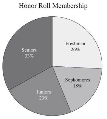
How to Read It
When you begin to read a circle graph, the first thing you want to know is what the graph is talking about. Look for a title to tell you the general topic. This graph shows how the list of students who made the honor roll breaks down by class. Sometimes the graph will have a caption to explain more clearly what it’s talking about. Next, look to the labels on the circle wedges. They should tell you what each of the wedges represents, and they may have values or percentages to tell you what part of the whole that wedge is. The graph below has four wedges, each labeled with the name of a class, and each has a percent that tells you what part of the honor roll comes from that class.
Sometimes your wedges are too small for labels or your labels are too long to fit neatly. Placing the label outside the circle near the wedge is the next best option, but if there are many small wedges, even that may be hard to do. In that case, the graph should have a legend. A legend is a small box near the graph that explains the code that you need to make sense of the graph. It should tell you what each color or pattern represents and probably include the percentages or values as well.
CHECK POINT
6. Draw a circle graph to represent the data below.
Land Area of NYC by Borough
Borough |
Manhattan |
The Bronx |
Brooklyn |
Queens |
Staten Island |
Land area (square miles) |
23 |
42 |
71 |
109 |
58 |
7. The largest borough (by land area) is approximately how many times larger than the smallest?
This graph shows the enrollment in various arts electives last year.
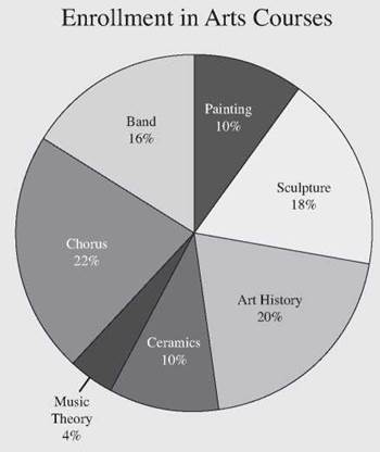
8. What percentage of the enrollment was in music courses?
9. Which arts course had the largest enrollment?
10. Which two courses had the most similar enrollments?
11. If a total of 461 students signed up for arts electives, how many students took Art History?