Basic Math and Pre-Algebra
PART 4. The State of the World
CHAPTER 19. Graphs
Line Graph
A line graph is a graph that connects points with line segments. The lines help to clarify the pattern of change in the values the points represent.
When to Use It
Line graphs are generally used to show the change in a quantity over time. A runner might record her times at each daily practice and create a line graph to help her see the pattern of improvement, or to see if there was a particular time when her times were slower or faster than usual.
How to Draw It
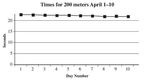
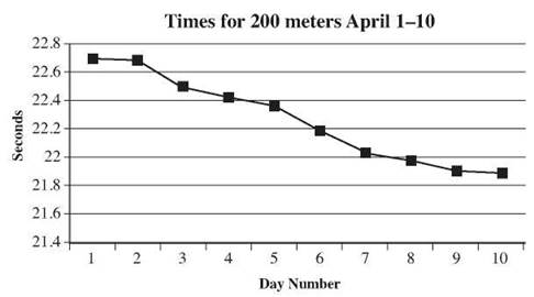
To create a line graph, you need data that has been recorded. Each entry should include a date or time and a value. Let’s suppose that runner recorded her times in seconds for the 200 meters every day in April. Here is her record for the first 10 days.
Day |
1 |
2 |
3 |
4 |
5 |
6 |
7 |
8 |
9 |
10 |
Time |
22.71 |
22.68 |
22.50 |
22.43 |
22.37 |
22.19 |
22.04 |
21.97 |
21.91 |
21.89 |
The horizontal scale should show the day numbers, in this case up to 10, equally spaced along the axis. The vertical scale must go high enough to record all the times, so up to about 23 seconds. Then place a dot in line with each day’s number at a height that corresponds to that day’s time in seconds on the vertical axis. Finally, connect the dots, day 1 to day 2 to day 3 and so on, using straight line segments.
You may find that your first attempt is not satisfactory. If you labeled your vertical scale from 0 to 23 seconds, the graph may look very flat. The runner’s times are only changing by a fraction of a second at a time.
A broken scale is a good idea here. Here’s what the same graph looks like if you use a broken scale, showing only 21.4 to 22.8 instead of 0 to 23. It’s much easier to see the changes in the runner’s times.
How to Read It
Line graphs should have a title to tell you what information is being presented. Check that first, then examine the scales. The horizontal scale should show time, and it should be clear what the units of time are (years, months, days, etc.). This graph shows the average number of absences due to illness at County High in the months from January to June.
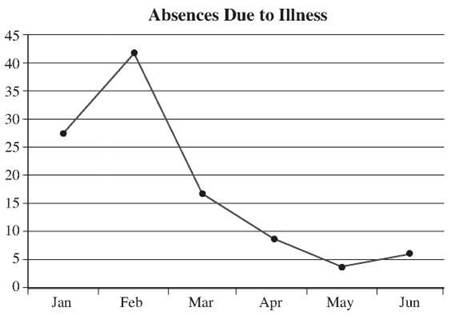
The range of numbers on the vertical scale and the units in which they are marked will depend on the information being presented, but take the time to read it and understand the units. This scale runs from 0 to 45, and the grid lines are every five units. Check for a broken scale and remember that a broken scale may distort your perception of size, just like in a bar graph, so examine the graph carefully. This scale is not broken, so there’s no concern.
The line segments connecting the points will help you see overall patterns, but don’t ignore the dots themselves. They are the actual observed and recorded data. The average number of absences due to illness at County High in May looks like 4. Connecting the points with lines is based on the assumption that the change from point to point is smooth and consistent, and that’s not always true. Be very cautious about making any predictions or drawing any conclusions from what the line segments are doing. For example, the lines in this graph suggest that the sharpest decline in absentees took place from February to March, and that there were increases from January to February and from May to June. You wouldn’t try to use the lines to say that there were 15 absentees on a certain date, however, because the line segments don’t represent recorded data, only trends.
CHECK POINT
12. Draw a line graph to represent the data below.
Esther’s Spending on Restaurant Meals for the First 10 Days of August
Date |
1-Aug |
2-Aug |
3-Aug |
4-Aug |
5-Aug |
6-Aug |
7-Aug |
8-Aug |
9-Aug |
10-Aug |
Cost $ |
9.80 |
19.53 |
6.25 |
23.20 |
8.55 |
20.05 |
14.95 |
23.45 |
6.75 |
15.20 |
13. Is there any pattern to Esther’s restaurant spending?
14. On which two days was Esther’s spending most similar?
The graph below shows the sales of hotdogs at Jenny’s Beach Bungalow over the course of the last year.
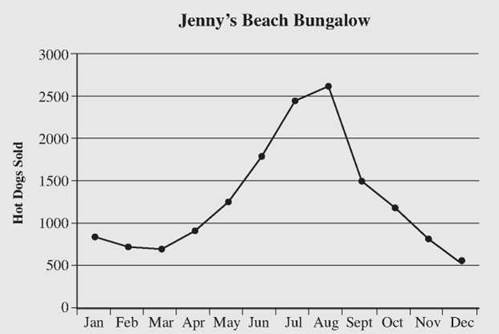
15. Over which period did sales have the greatest positive change?
16. Over which period did sales have the steepest drop?
17. Which autumn month had sales most similar to the number of hot dogs sold in February?
The Least You Need to Know
• Bar graphs are used to compare the sizes of different quantities.
• A histogram shows how frequently a particular value occurs. Although they look similar, bar graphs and histograms are different types of graphs.
• Circle graphs show parts of a whole.
• A line graph tracks the change in one quantity over time.
• For any graph, always examine the information presented carefully. Pay attention to titles, units, and scale.