SAT 2016
CHAPTER 8
The SAT Math Test: Problem Solving and Data Analysis
Skill 4: Working with Graphs of Data
Lesson 13: Working with scatterplots
Scatterplots are graphs of ordered pairs that represent data points. They are very useful for showing relationships between variables that do not vary in a highly predictable way.
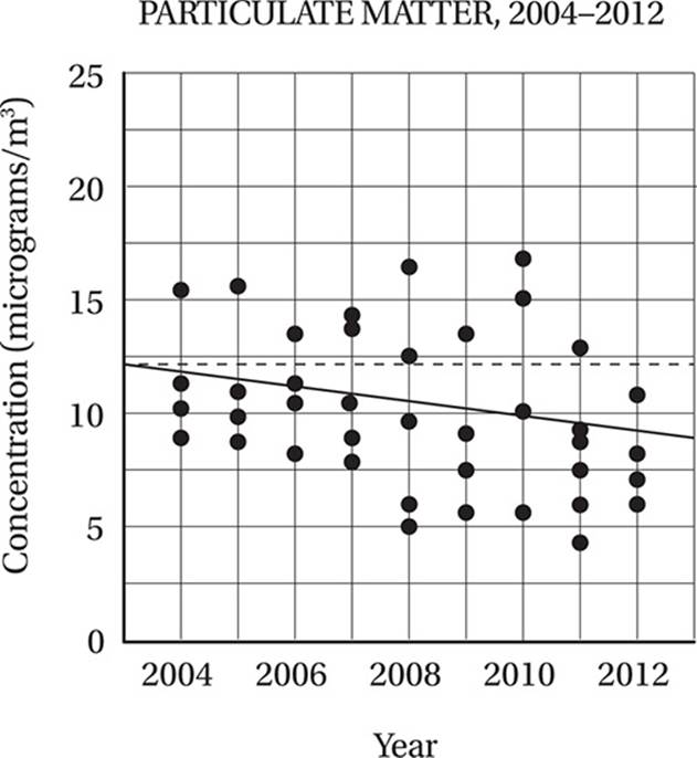
Particulate matter is a class of air pollutants. The scatterplot above shows 40 readings for particulate matter concentration, in micrograms per cubic meter, for a particular metropolitan area over 9 years. Based on the line of best fit shown, which of the following is closest to the average yearly decrease in particulate matter concentration?
A) 0.32 micrograms/m3 per year
B) 0.64 micrograms/m3 per year
C) 3.2 micrograms/m3 per year
D) 6.4 micrograms/m3 per year
A line of best fit is simply a line that “hugs” the data in a scatterplot better than any other line. In a statistics course, you will learn how to calculate a line of best fit precisely (or your calculator can do it for you), but the SAT will only expect you to use lines of best fit to make inferences about general trends in data or to find “expected values.”
(Medium) In this problem, the line of best fit shows a general downward trend in the data, even though the data are fairly widely scattered. To find the “average yearly decrease” in particulate matter concentration, we simply have to find the slope of this line. To get the most accurate estimate for slope, we should take points on the line that are far apart. The leftmost endpoint seems to be at (2003, 12), and the rightmost endpoint seems to be at (2013, 9). This gives us a slope of (9 − 12)/(2013 − 2003) = −3/10 = −0.3 micrograms/m3 per year, so the correct answer is (A).
According to the line of best fit to the data above, which of the following is closest to the percent decrease in average particulate matter concentration from 2007 to 2012?
A) 9%
B) 18%
C) 36%
D) 60%
(Medium-hard) This question is similar to the previous one, but notice the two important differences: first, it is asking us to compare two specific years, and it is asking us to calculate the percent decrease rather than the rate of decrease, so we will need the percent change formula from Lesson 8. The line of best fit gives a value of about 11 in 2007 and about 9 in 2012. Therefore the percent change is (9 − 11)/11 × 100% = −18%, and the correct answer is (B).
If the Environmental Protection Agency”s air quality standard is 12 micrograms of particulate matter per cubic meter, as shown with the dotted line, what percent of these data fall above this standard?
A) 11%
B) 14.5%
C) 27.5%
D) 35%
(Easy) This question is simply asking for a part-to-whole ratio expressed as a percentage. There are 40 total data points (as the problem states), and 14 of them lie above the line: 14/40 × 100% = 35%, so the correct answer is (D).
Lesson 14: Linear and non linear relationships
Sometimes the SAT Math test will ask you to draw inferences from graphs that are non-linear. Even if a graph is not linear, you should still be able to draw inferences based on the points on that graph. For instance, you should be able to find the average rate of change between two points by finding the slope of the line segment connecting them, or compare the rate of growth of one curve to that of another curve.

The graph above shows the number of cells in two separate bacterial cultures as a function of time. How much time elapsed between the point when the two cultures had equal population and the point when the population of culture A was twice that of culture B?
A) 2 minutes
B) 3 minutes
C) 4 minutes
D) 5 minutes
(Medium) The time when the two populations are equal is easy to find: it”s where the two curves intersect, at the 4-minute mark. The four answer choices tell us where to look next on the graph. Since choice (A) is 2 minutes, we should find the populations at the 4 + 2 = 6-minute mark. At 6 minutes, culture B has a population of 700 and culture A has a population of 1,400, which of course is twice as great, and therefore the answer is (A).
How much longer did it take culture B to double its original population than it took culture A?
A) 2 minutes
B) 3 minutes
C) 4 minutes
D) 5 minutes
(Medium) Culture A has a starting population of 200 and doubles its population to 400 at the 3-minute mark. Culture B has a starting population of 400 and doubles its population to 800 at the 8-minute mark. Therefore, culture B took 8 − 3 = 5 more minutes to double its population, and the correct answer is (D).
Lesson 15: Drawing inferences from graphs
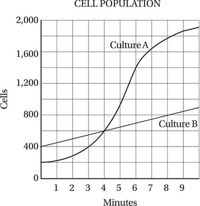
If culture B were to continue its linear growth, how many more minutes (beyond the 10 minutes shown in the graph) would be required for culture B to reach 1,500 cells?
A) 9 minutes
B) 12 minutes
C) 13.5 minutes
D) 15 minutes
(Medium) By taking any two points on the line for culture B, for instance (0,400) and (4,600), we can calculate the slope of the line, which equals the unit rate of growth: (600 − 400)/(4 − 0) = 50 cells per minute. Since culture B contains 900 cells at the 10 minute mark, it would take 600/50 = 12 more minutes to reach 1,500 cells, and the correct answer is (B).
A particular experiment requires that both culture A and culture B contain between 400 and 800 cells each. The time period in which the cell population for both cultures is within this range is called the “experimental window.” Which of the following is closest to the “experimental window” for the two cultures shown in the graph above? (1 minute = 60 seconds)
A) 95 seconds
B) 120 seconds
C) 165 seconds
D) 240 seconds
(Medium-hard) The “experimental window” is the period when both populations are between 400 and 800. The population of culture A hits 400 at the 3-minute mark and exceeds 800 cells after roughly the 4.6-minute mark. The population of culture B starts off (at the 0-minute mark) at 400 cells, and exceeds 800 cells after the 8-minute mark. The overlapping period is between 3 minutes and 4.6 minutes, for a period of roughly 1.6 minutes or 1.6 × 60 = 96 seconds; therefore, the correct answer is (A).
Lesson 16: Working with pie graphs
We”ve all seen pie graphs. They are convenient ways of representing part-to-part and part-to-whole relationships. On the SAT Math test, you may be asked to analyze the features of pie graphs in some detail, or to discuss the features of a hypothetical pie graph.
When analyzing pie graphs, remember this helpful formula:

In the diagram above, which of the following is closest to the measure of the central angle of the sector representing total minority ownership of U.S. broadcast television media in 2007?
A) 3°
B) 8°
C) 12°
D) 15°
(Easy) According to the graphic, the total minority ownership of television media in 2007 was 0.6% + 1.3% + 0.9% + 0.4% = 3.2%. Therefore the central of the sector representing this portion measures 0.032 × 360° = 11.52°, so the correct answer is (C).
Maria is constructing a pie graph to represent the expenses for her project, consisting of three expense categories: marketing, design, and development. She knows that the marketing expenses are $12,000 and the design expenses are $30,000, but the development expense could range anywhere from $30,000 to $48,000. Based on this information, which of the following could be the measure of the central angle of the sector representing marketing expenses?
A) 36°
B) 54°
C) 62°
D) 70°
(Medium-hard) The measure of the central angle of the sector depends on the part-to-whole ratio, so we need to calculate the maximum and minimum part-to-whole ratio for the marketing expenses, the marketing expenses are fixed at $12,000, but the total expenses could range from $12,000 + $30,000 + $30,000 = $72,000 to $12,000 + $30,000 + $48,000 = $90,000. This means that the part-to-whole ratio for marketing could range from 12,000/90,000 = 0.133 to 12,000/72,000 = 0.167. Therefore the central angle for the marketing sector can measure anywhere from 0.133 × 360° = 48° to 0.167 × 360° = 60°. The only choice in this range is (B) 54°.
Exercise Set 5 (Calculator)
![]()
Questions 1–4 refer to the following information
1
The scatterplot above shows the annual revenue for all of the individual retail stores operated by a clothing company for each year from 2004 through 2012. Based on the line of best fit to the data shown, which of the following is closest to the percent increase in revenue per store from 2005 to 2011?
A) 50%
B) 100%
C) 120%
D) 300%
2
In 2006, the total combined revenue for all stores was closest to
A) $350,000
B) $480,000
C) $700,000
D) $950,000
3
From 2009 to 2010, the total combined revenue for all stores increased by approximately
A) $50,000
B) $200,000
C) $400,000
D) $600,000
4
Between 2006 and 2012, what was the percent increase in the total number of retail stores for this company?
A) 45%
B) 50%
C) 100%
D) 200%

Questions 5–9 refer to the following information
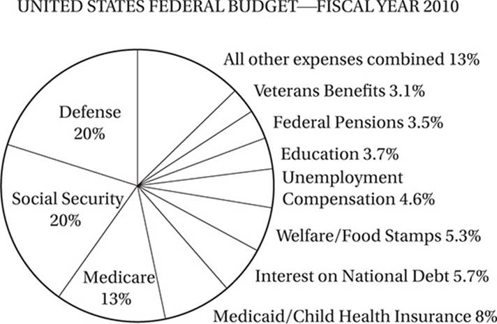
5
The chart above shows the allocation of $3.5 trillion in U.S. federal expenses for 2010. What were the total 2010 expenditures on Defense?
A) $700 billion
B) $70 billion
C) $7 billion
D) $700 million
6
What is the measure of the central angle for the sector representing Medicare expenses?
A) 13.0°
B) 45.5°
C) 46.8°
D) 48.2°
7
If Interest on National Debt expenses were to decrease by $20 billion from their 2010 levels, this would represent a percent decrease of approximately
A) 6%
B) 10%
C) 12%
D) 15%
8
How much more did the United States spend in 2010 on Interest on National Debt than on Education?
A) $2 billion
B) $7.0 billion
C) $20 billion
D) $70 billion
9
If 50% of the budget for Federal Pensions were to be reallocated as Social Security expenses, the size of the Social Security budget would increase by what percent?
A) 1.75%
B) 8.75%
C) 17.75%
D) 21.75%
Questions 10–17 refer to the following information
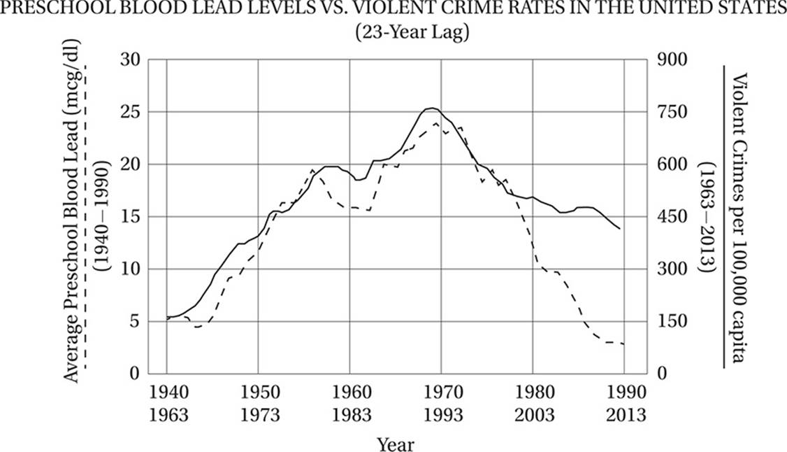
Source: Rick Nevin, Lead Poisoning and the Bell Curve, 2012
10
According to the graph above, in 1970 the number of violent crimes per 100,000 capita in the United States was closest to
A) 25
B) 375
C) 700
D) 750
11
In 1970 the average preschool blood lead level, in mcg/dL, was closest to
A) 10
B) 12
C) 23
D) 25
12
The percent decline in violent crime from 1993 to 2013 is closest to
A) 11%
B) 35%
C) 47%
D) 88%
13
From 1970 to 1990, the average annual rate of decline in preschool blood lead levels, in mcg/dL per year, was approximately
A) 1
B) 5
C) 15
D) 17
14
Which of the following 10-year spans saw the greatest percent increase in preschool blood lead levels?
A) 1945–1955
B) 1955–1965
C) 1965–1975
D) 1975–1985
15
Which of the following five-year spans saw the greatest percent increase in violent crime?
A) 1963–1968
B) 1968–1973
C) 1973–1978
D) 1978–1983
16
Approximately how many years did it take for average preschool blood lead levels to return to their 1950 levels?
A) 25
B) 30
C) 35
D) 40
17
For approximately how many years between 1963 and 2013 was the violent crime rate in the United States greater than 375 crimes per 100,000 capita?
A) 25
B) 30
C) 37
D) 42
![]()
EXERCISE SET 5 ANSWER KEY
1. C In 2005, the revenue per store, according to the line of best fit, was about $300,000, and in 2012 it was about $650,000, so the percent change is (650,000 − 300,000)/300,000 × 100% = 116.67%, which is closest to (C) 120%.
2. D In 2006, the data points show that there were 3 stores, with revenue of roughly $200,000, $330,000, and $420,000, for a total of $950,000.
3. D In 2009, the combined revenue for the three stores was approximately $420,000 + $450,000 + $550,000 = $1,420,000. In 2010, the combined revenue for four stores was approximately $220,000 + $520,000 + $600,000 + $675,000 = $2,015,000, for an increase of about $595,000.
4. C In 2006 there were 3 stores and in 2012 there were 6 stores, which is an increase of (6 − 3)/3 × 100% = 100%.
5. A The chart shows that 20% of the expense budget went to defense, which equals 0.2 × $3,500,000,000,000 = $700 billion.
6. C Medicare accounts for 13% of expenses, so the sector angle is 0.13 × 360° = 46.8°.
7. B The Interest on National Debt in 2010 was 0.057 × $3.5 trillion = $199.5 billion, so a decrease of $20 billion would be 20/199.5 × 100% = 10%.
8. D The difference between Interest on National Debt and Education is 5.7% − 3.7% = 2%, and 0.02 × $3.5 trillion = $70 billion.
9. B The Social Security budget in 2010 was 0.20 × $3.5 trillion = $700 billion. 50% of the Federal Pensions budget is 0.5 × 0.035 × $3.5 billion = $61.25 billion. This would be an increase of 61.25/700 × 100% = 8.75%.
10. B The vertical axis label on the left shows that the violent crime trend is indicated by the solid curve and the bottom time series (1963–2013). For this curve, 1970 is slightly to the left of the vertical line at 1973, which shows values clearly between 300 and 450.
11. C The vertical axis label on the left shows that the preschool blood lead trend is indicated by the dashed curve and the top time series (1940–1990).
12. C In 1993, the violent crime rate was 750, and in 2013 it was about 400. The percent decrease is therefore (400 − 750)/750 × 100% = 46.7%
13. A In 1970, the blood lead levels were about 23 and in 1990, they were about 3. The rate of decline is therefore (23 − 3)/(1990 − 1970) = 1 mcg/dL per year.
14. A From 1945–1955 preschool blood lead levels increased from about 5 to about 17, a percent increase of (17 − 5)/5 × 100% = 240%.
15. A The question asks for the greatest percent increase, not the greatest net increase in violent crime. Notice that the net increase from 1963–1968 (from roughly 150 to 250) seems to be slightly less than net increase from 1968–1973 (from roughly 250 to 375), the percent increase from 1963–1968 (+67%) is clearly greater than that from 1968–1973 (+50%).
16. B In 1950, blood lead levels were about 12 mcg/dL, and they did not return to this level until 1980.
17. D The graph indicates that from about 1970 to 2013, the violent crime rate was above 375 crimes per 100,000 capita.