GRE Premier 2017 with 6 Practice Tests
Part III. QUANTITATIVE REASONING
Chapter 13. Data Interpretation
Introduction to Data Interpretation Questions
Data Interpretation questions are based on information located in tables or graphs, and they are often statistics oriented. The data may be located in one table or graph, but you might also need to extract data from two or more tables or graphs. There will be a set of questions for you to answer based on each data presentation.
You may be asked to choose one or more answers from a set of answer choices or to enter your answer in a Numeric Entry field.
The directions for Data Interpretation questions will look like this:
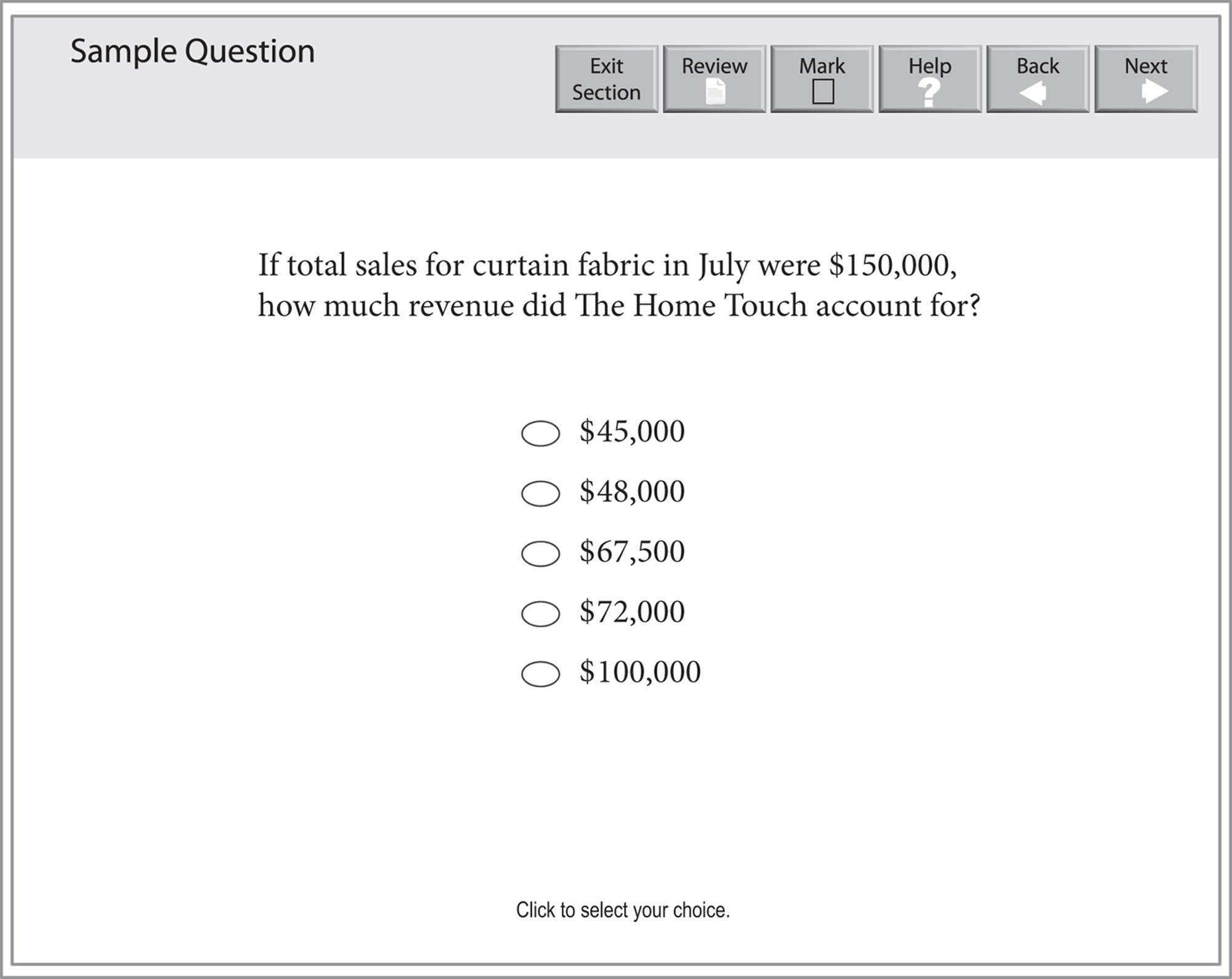
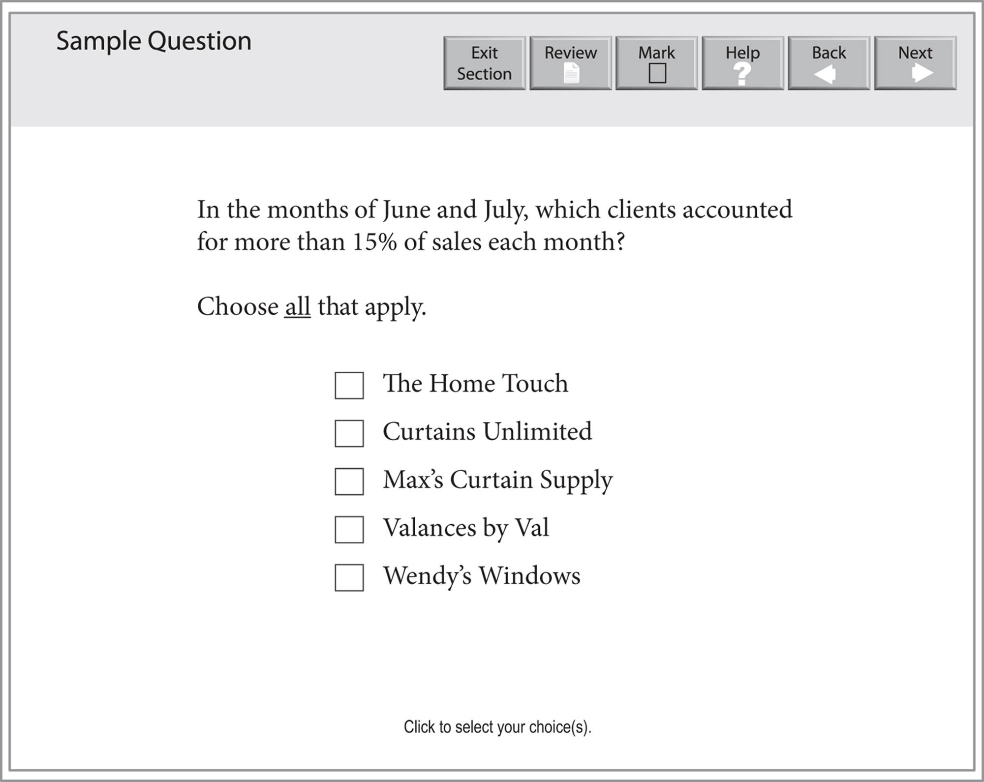
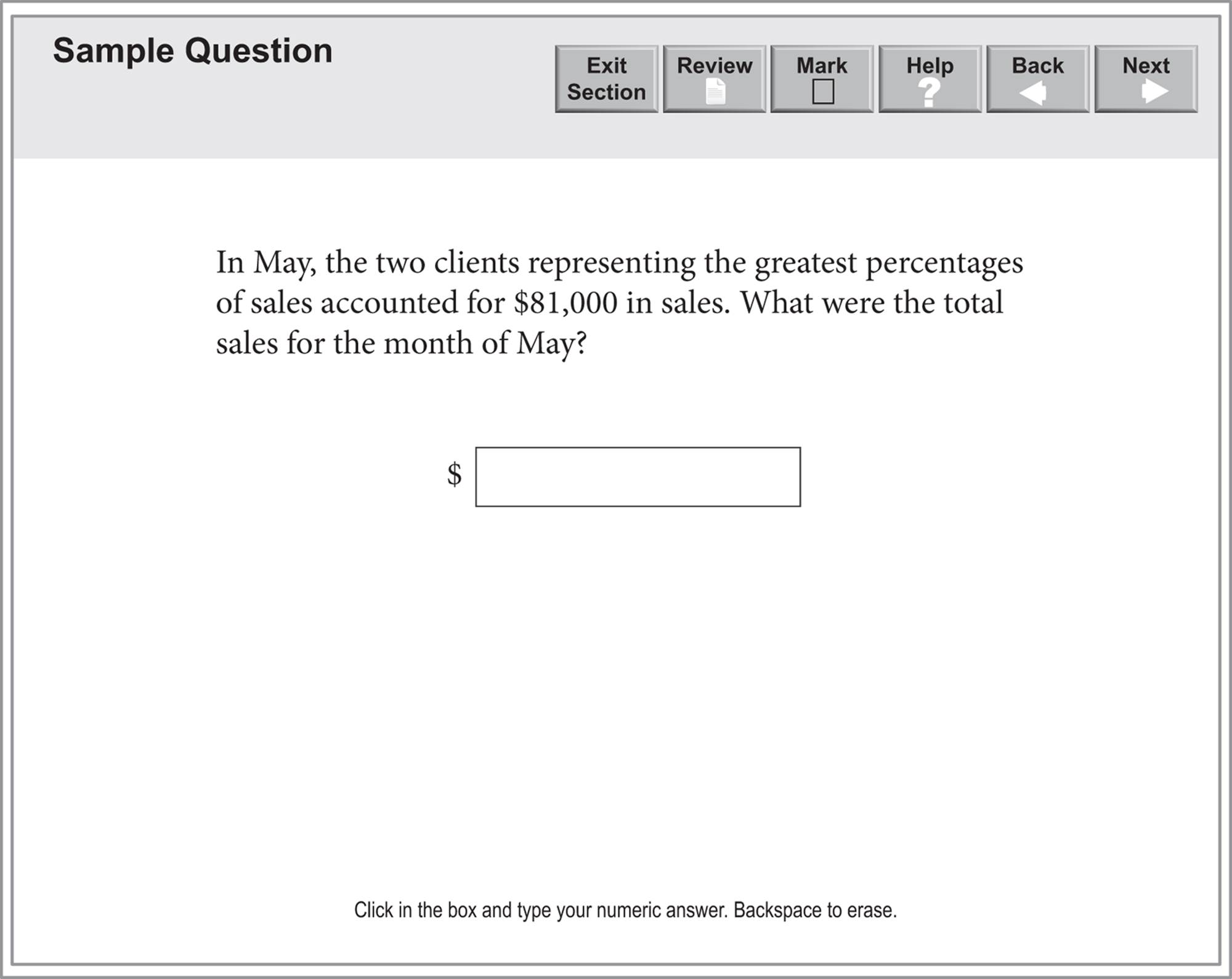
Questions 15–17 are based on the following table.
PERCENT OF SALES PER CLIENT FOR CURTAIN FABRIC OVER THREE MONTHS
|
May |
June |
July |
|
|
The Home Touch |
45% |
25% |
48% |
|
Curtains Unlimited |
30% |
23% |
23% |
|
Max’s Curtain Supply |
9% |
23% |
17% |
|
Valances by Val |
13% |
20% |
8% |
|
Wendy’s Windows |
3% |
9% |
4% |
A Data Interpretation question that requires you to choose exactly one correct answer will look like this:
A Data Interpretation question that requires you to select all the answer choices that apply will look like this:
A Data Interpretation question that requires you to enter your numeric answer in a box will look like this:
The Kaplan Method for Data Interpretation
1. STEP 1
Analyze the tables and graphs.
2. STEP 2
Approach strategically.
HOW THE KAPLAN METHOD FOR DATA INTERPRETATION WORKS
Now let’s discuss how the Kaplan Method for Data Interpretation works.
1. ![]() STEP 1
STEP 1
Analyze the tables and graphs.
Tables, graphs, and charts often come in pairs that are linked in some way (for example, a manufacturer’s total revenue and its revenue by product line). Familiarize yourself with the information in both graphs (or tables) and with how the two are related before attacking the questions. Scan the figures for these components:
· Title. Read the charts’ titles to ensure you can get to the right chart or graph quickly.
· Scale. Check the units of measurement. Does the graph measure miles per minute or hour? Missing the units can drastically change your answer.
· Notes. Read any accompanying notes—the GRE will typically give you information only if it is helpful or even critical to getting the correct answer.
· Key. If there are multiple bars or lines on a graph, make sure you understand the key so you can match up the correct quantities with the correct items.
2. ![]() STEP 2
STEP 2
Approach strategically.
Data Interpretation questions are designed to test your understanding of fractions and percents and your attention to detail. Taking a split second to make sure you answered the right question can make the difference between a correct answer and the “right” answer to the wrong question.
Questions tend to become more complex as you move through a set. For instance, if a question set contains two graphs, the first question likely refers to just one graph. A later question will most often combine data from both graphs. If you don’t use both graphs for this later question, the chances are good you have missed something.
No matter how difficult graph questions appear at first glance, you can usually simplify single-answer multiple-choice questions by taking advantage of their answer-choice format. By approximating the answer rather than calculating it wherever possible, you can quickly identify the right one. As we saw with Problem Solving, estimation can be one of the fastest ways to identify the correct answer in math problems. Data Interpretation questions benefit from this strategy, as they tend to be the most time-consuming questions to answer.
HOW TO APPLY THE KAPLAN METHOD FOR DATA INTERPRETATION
Now let’s apply the Kaplan Method to a Data Interpretation question:
· 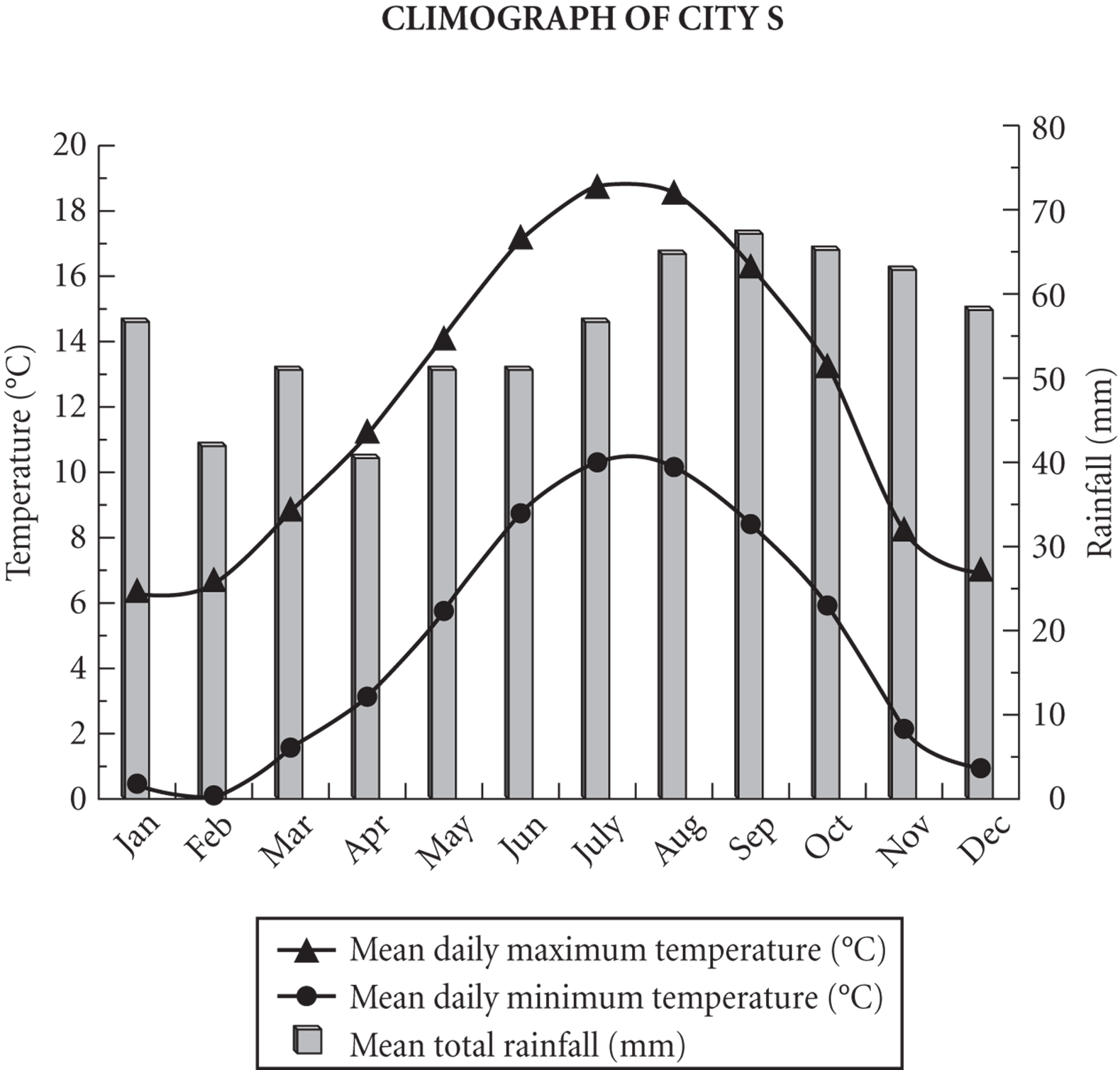
The Tourism Board of City S uses the information provided in the climograph to market the city as a tourist destination. One criterion is that the average monthly rainfall be less than 60 millimeters. What fraction of the months meet this criterion?

1. ![]() STEP 1
STEP 1
Analyze the tables and graphs.
Take the analysis of the graph step-by-step. Start with the title of the graph to verify that the data given are for City S. Then take note of the scale for each type of information—degrees Celsius for temperature and millimeters for rainfall. There are data for each month of the year, which means you will not have to convert the units to answer the question that’s being asked.
2. ![]() STEP 2
STEP 2
Approach strategically.
The question asks only about rainfall; those data are given by the bars on the graph. According to the bars, rainfall is greater than 60 mm in August, September, October, and November. That’s 4 of 12 months that do not meet the criteria, so 8 of 12 months do meet it. You may enter the fraction ![]() directly into the boxes, and your answer will be accepted. It is not required that you reduce it.
directly into the boxes, and your answer will be accepted. It is not required that you reduce it.
Now let’s apply the Kaplan Method to a second Data Interpretation question:
· 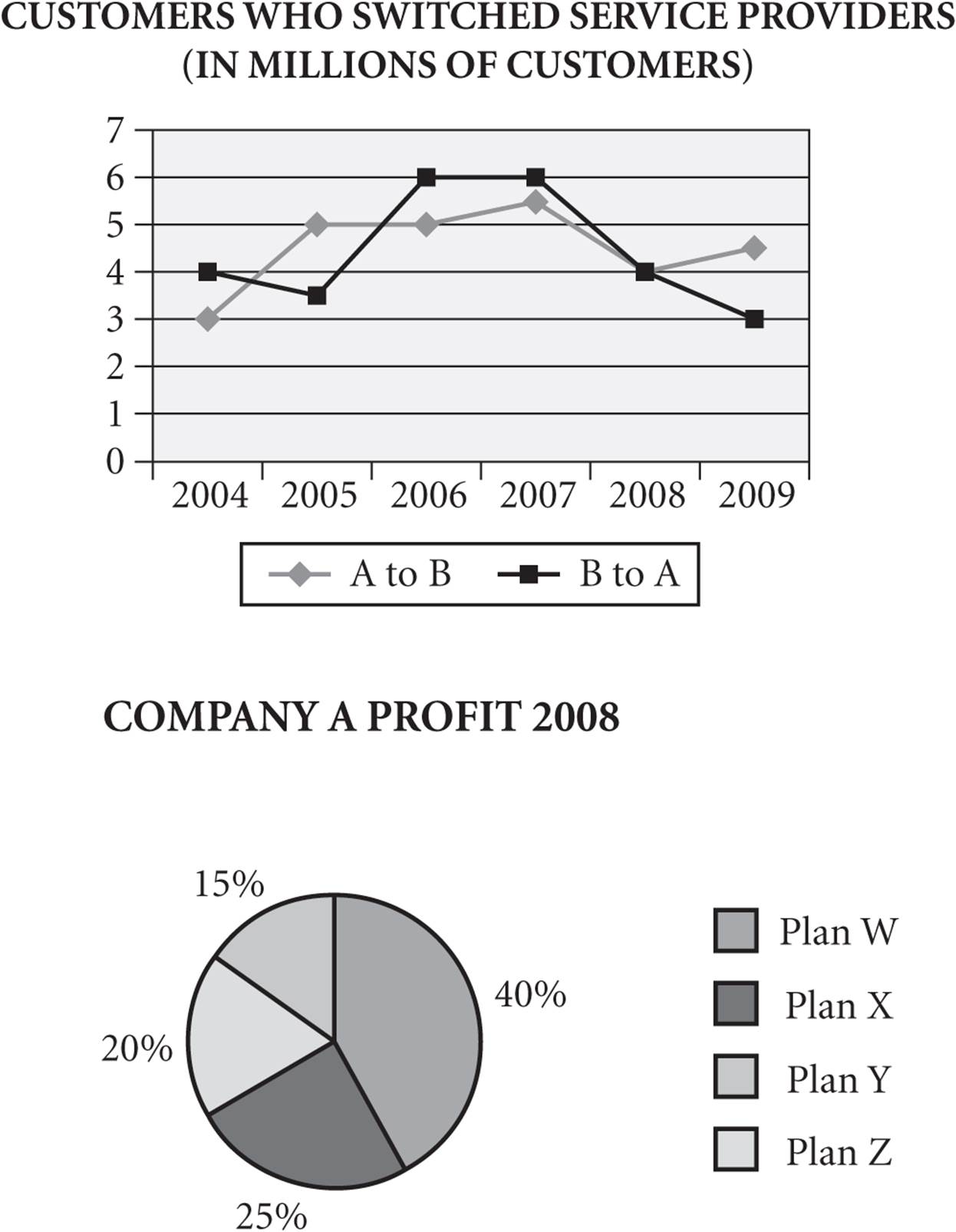
In 2008, Company A had a total profit of $220 million. If half of the customers who switched to Company A were responsible for half of the profit for Plan X, how much did these customers contribute per person toward Company A’s profit for the year?
1. $1.10
2. $13.75
3. $20.25
4. $27.50
5. $55.00
1. ![]() STEP 1
STEP 1
Analyze the tables and graphs.
This question has information about numbers of customers switching service providers for various years. It also has information about one company’s profit for the year 2008, so the data in the two graphs will be linked by the year 2008.
2. ![]() STEP 2
STEP 2
Approach strategically.
Approach the question methodically, starting with identifying the number of customers who switched to Company A. The line chart indicates that 4 million customers switched to Company A. This is the only information needed from the top graph.
The pie chart shows the breakdown of profit from the various plans offered and indicates that 25 percent of the profit came from Plan X.
The other information you need to get to the correct answer is given in the question stem:
· Profit of $220 million.
· Half of the customers who switched were responsible for half of Plan X’s profits.
Now that your information is organized, all you need to do is the calculation. Plan X accounts for 25 percent of $220 million = $55 million. Half of $55 million is $27.5 million.
If 4 million people switched, then half of the people who switched would be 2 million.
The last step is to divide $27.5 by 2 (you can drop the zeroes in the millions because they will cancel out): $27.5 ÷ 2 = $13.75. The correct choice is (B).
Now let’s apply the Kaplan Method to a third Data Interpretation question:
·
The management of Company B is most interested in the data for the years in which there were at least one million more customers who switched from Company A to Company B than switched from Company B to Company A. In which years did this happen?
Choose all that apply.
1. 2005
2. 2006
3. 2007
4. 2008
5. 2009
1. ![]() STEP 1
STEP 1
Analyze the tables and graphs.
This question asks for a comparison of facts between Company A and Company B. Take time to verify which line in the top graph represents customers switching to Company A and which line represents customers switching to Company B. Confirm that the title states that the data are given in millions and then look at the scale on the line graph.
2. ![]() STEP 2
STEP 2
Approach strategically.
After examining the line graph carefully, you are ready to gather the information needed to answer the question. The years that satisfy the requirement are those years for which the line representing A to B is at least one full horizontal row above the line representing B to A. Read the graph carefully because you must identify all the correct choices to get credit for a correct answer.
When you are clear what to look for on the graph, start from the left and identify the years 2005 and 2009 as those in which at least one million more customers switched from A to B than switched from B to A. These are choices (A) and (E).
Kaplan’s Additional Tips for Data Interpretation Questions
Slow Down
There’s always a lot going on in Data Interpretation problems—both in the charts and in the questions themselves. If you slow down the first time through, you can avoid calculation errors and having to reread the questions and charts.
Pace Yourself Wisely
To ensure that you score as many points on the exam as possible, use the allotted time for a section wisely. Remember that each question type has the same value. If you must miss a few questions in a section, make them the ones that would take you the longest to answer, not the ones at the end of the section that you could have answered correctly but simply didn’t get to. Data Interpretation questions are generally some of the more time-consuming ones to answer, and if answering them isn’t one of your strong suits, save them for the end.
Data Interpretation Practice Set
Try the following Data Interpretation questions using the Kaplan Method for Data Interpretation. If you’re up to the challenge, time yourself; on Test Day, you’ll want to spend only about 2 minutes on each question.
1.
2. Questions 1–5 are based on the following graphs.
3. 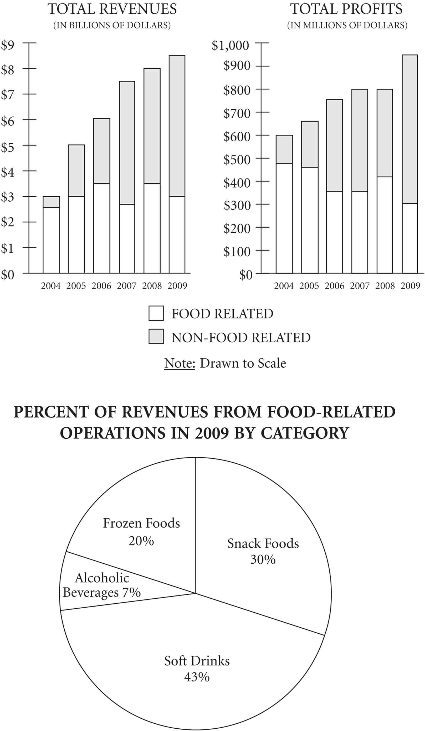
1. Approximately how much did total revenues increase from 2004 to 2007?
1. $0.5 billion
2. $1.5 billion
3. $4 billion
4. $4.5 billion
5. $5 billion
2. For the year in which profits from food-related operations increased over the previous year, total revenues were approximately:
1. $3.5 billion
2. $4.5 billion
3. $5.7 billion
4. $6 billion
5. $8 billion
3. In 2008, total profits represented approximately what percent of total revenues?
1. 50%
2. 20%
3. 10%
4. 5%
5. 1%
4. For the first year in which revenues from non-food-related operations surpassed $4.5 billion, total profits were approximately:
1. $250 million
2. $450 million
3. $550 million
4. $650 million
5. $800 million
5. In 2009, how many millions of dollars were revenues from frozen food operations?
millions of dollars
Answers and Explanations
DATA INTERPRETATION PRACTICE SET
1. DThis question asks about total revenues, so you should refer to the left bar graph. Each bar in the graph has two components, but you want to look at the total height of the bars for 2004 and 2007 because the question asks about total revenues. Total revenues for 2004 appear to be $3 billion, and for 2007 they appear to be about $7.5 billion. So the increase is roughly $7.5 billion − $3 billion = $4.5 billion. Answer choice (D) is correct.
2. EYou have to refer to both bar graphs to answer this question. First, refer to the right bar graph to find the lone year in which food-related profits increased over the previous year—the only year in which the unshaded portion of the bar increases in size is 2008. Now that you’ve zeroed in on the year, refer to the left bar graph to determine the total revenuesfor that year, which appear to be about $8 billion. Answer choice (E) is correct.
3. C
This is a percent question, so start with the bar graphs. You need the figures from both food-related and non-food-related sources, so look at the total height of the bars. From the right bar graph, the total profits for 2008 appear to be $800 million; from the left bar graph, total revenues for that year appear to be $8 billion (i.e., $8,000 million). Now, convert the part/whole into a percent:
![]()
4. EFirst, find the year for which revenues from non-food-related operations surpassed $4.5 billion on the left bar graph. Finding the correct bar is made more difficult by the fact that you have to deal with the shaded portion, which is at the top of the bar, not at the bottom. Looking carefully, you should then see that 2007 is the year in question. The question asks for total profits, so once again refer to the right bar graph, and you’ll see the profits for that year are around $800 million. This matches answer choice (E).
5. 600Finally, you have a question that refers to the pie chart. You are asked about revenues from frozen food operations, and the pie chart tells you that frozen foods represent 20 percent of all food-related revenues for 2009. To convert this into an amount, you need to locate the amount of food-related revenues for 2009. Once again, refer to the left bar graph, where you’ll find that food-related revenues in 2009 were $3 billion, or $3,000 million. Then calculate that 20 percent of $3,000 million is $600 million.