Barron's GRE, 18th Edition (2009)
Part 4. QUANTITATIVE ABILITY: TACTICS, STRATEGIES, PRACTICE, AND REVIEW
Chapter 13. Data Interpretation Questions
Four of the 28 questions in the quantitative section are data interpretation questions. As their name suggests, these questions are always based on the information that is presented in some form of a graph or a chart. Occasionally, the data are presented in a chart or table, but much more often, they are presented graphically. The most common types of graphs are
· line graphs
· bar graphs
· circle graphs
Data interpretation questions always appear in two sets of two questions each. For example, questions 14 and 15 might refer to a particular set of graphs or charts, and then later there will be two more questions, say numbers 22 and 23, which refer to a completely different set of graphs and charts.
When the first data interpretation question appears, one or more graphs will be on the left-hand side of the screen, and the question will be on the right-hand side. It is possible that you will have to scroll down in order to see all of the data. After you confirm your answer to the first question, the second question will replace it on the right-hand side of the screen; the graphs, of course, will still be on the left-hand side for you to refer to.
The tactics discussed in this chapter can be applied to any type of data, no matter how they are displayed. In the practice exercises at the end of the chapter, there are data interpretation questions based on every type of graph that could appear on the GRE. Carefully, read through the answer explanations for each exercise, so that you learn the best way to handle each type of graph.
Infrequently, an easy data interpretation question will require only that you read the graph and find a numerical fact that is displayed. Usually, however, you will have to do some calculation on the data that you are analyzing. In harder questions, you may be given hypothetical situations and asked to make inferences based on the information provided in the given graphs.
Testing Tactics
The four questions that follow will be used to illustrate the tactics that you should use in answering data interpretation questions. Remember, however, that on the GRE there will always be exactly two questions that refer to a particular graph or set of graphs.
Questions 1–4 refer to the following graphs.
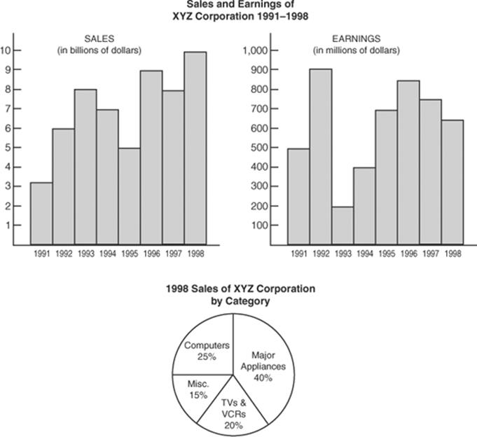
1. What is the average (arithmetic mean) in billions of dollars of the sales of XYZ Corporation for the period 1991–1998?
(A) 5.5 (B) 6.0 (C) 7.0 (D) 8.0 (E) 8.5
2. For which year was the percentage increase in earnings from the previous year the greatest?
(A) 1992 (B) 1993 (C) 1994 (D) 1995 (E) 1996
3. Which of the following statements can be deduced from the data in the given charts and circle graph?
I. Sales of major appliances in 1998 exceeded total sales in 1991.
II. Earnings for the year in which earnings were greatest were more than sales for the year in which sales were lowest.
III. If in 1998, the sales of major appliances had been 10% less, and the sales of computers had been 10% greater, the sales of major appliances would have been less than the sales of computers.
(A) None (B) I only (C) III only (D) I and III only (E) I, II, and III
4. What was the ratio of earnings to sales in 1993?![]()
![]() First Read the Titles
First Read the Titles
When the first data interpretation question appears on the screen, do not even read it! Before you attempt to answer a data interpretation question, take 15 to 30 seconds to study the graphs. Try to get a general idea about the information that is being displayed.
Observe that the bar graphs on which questions 1–4 are based present two different sets of data. The bar graph on the left-hand side provides information about the sales of XYZ Corporation, and the right-hand graph provides information about the corporation’s earnings. Also, note that whereas sales are given in billions of dollars, earnings are given in millions of dollars. Finally, the circle graph gives a breakdown by category of the sales of XYZ Corporation for one particular year.
![]() Don’t Confuse Percents and Numbers
Don’t Confuse Percents and Numbers
Many students make mistakes on data interpretation questions because they don’t distinguish between absolute numbers and percents. Although few students would look at the circle graph shown and think that XYZ Corporation sold 25 computers in 1998, many would mistakenly think that it sold 15% more major appliances than computers.
The problem is particularly serious when the questions involve percent increases or percent decreases. In question 2 you are not asked for the year in which the increase in earnings from the previous year was the greatest. You are asked for the year in which the percent increase in earnings was the greatest. A quick glance at the right-hand graph reveals that the greatest increase occurred from 1991 to 1992 when earnings jumped by $400 million. However, when we solve this problem in the discussion of TACTIC 3, you will see that Choice A is not the correct answer.
NOTE: Since many data interpretation questions involve percents, you should carefully study Section 14-C, and be sure that you know all of the tactics for solving percent problems. In particular, always try to use the number 100 or 1000, since it is so easy to mentally calculate percents of powers of 10.
![]() Whenever Possible, Estimate
Whenever Possible, Estimate
Since you are not allowed to have a calculator when you take the GRE, you will not be expected to do complicated or lengthy calculations. Often, thinking and using some common sense can save you considerable time. For example, it may seem that in order to get the correct answer to question 2, you have to calculate five different percents. In fact, you only need to do one calculation, and that one you can do in your head!
Just looking at the Earnings bar graph, it is clear that the only possible answers are 1992, 1994, and 1995, the three years in which there was a significant increase in earnings from the year before. From 1993 to 1994 expenditures doubled, from $200 million to $400 million — an increase of 100%. From 1991 to 1992 expenditures increased by $400 million (from $500 million to $900 million), but that is less than a 100% increase (we don’t care how much less). From 1994 to 1995 expenditures increased by $300 million (from $400 million to $700 million); but again, this is less than a 100% increase. The answer is C.
![]() Do Each Calculation Separately
Do Each Calculation Separately
As in all Roman numeral questions, question 3 requires you to determine which of three separate statements is true. The key is to work with the statements individually.
To determine whether or not statement I is true, look at both the Sales bar graph and the circle graph. In 1998, total sales were $10 billion, and sales of major appliances accounted for 40% of the total: 40% of $10 billion = $4 billion. This exceeds the $3 billion total sales figure for 1991, so statement I is true.
In 1992, the year in which earnings were greatest, earnings were $900 million. In 1991, the year in which sales were lowest, sales were $3 billion, which is much greater than $900 million. Statement II is false.
In 1998, sales of major appliances were $4 billion. If they had been 10% less, they would have been $3.6 billion. That year, sales of computers were $2.5 billion (25% of $10 billion). If computer sales had increased by 10%, sales would have been $2.75 billion. Statement III is false.
The answer is B: only statement I is true.
![]() Use Only the Information Given
Use Only the Information Given
You must base your answer to each question only on the information in the given charts and graphs. It is unlikely that you have any preconceived notion as to the sales of XYZ Corporation, but you might think that you know the population of the United States for a particular year or the percent of women currently in the workplace. If your knowledge contradicts any of the data presented in the graphs, ignore what you know. First of all, you may be mistaken; but more important, the data may refer to a different, unspecified location or year. In any event, always base your answers on the given data.
![]() Always Use the Proper Units
Always Use the Proper Units
In answering question 4, observe that earnings are given in millions, while sales are in billions. If you answer too quickly, you might say that in 1993 earnings were 200 and sales were 8, and conclude that the desired ratio is ![]() =
= ![]() . You will avoid this mistake if you keep track of units: earnings were 200 million dollars, whereas sales were 8 billion dollars. The correct ratio is
. You will avoid this mistake if you keep track of units: earnings were 200 million dollars, whereas sales were 8 billion dollars. The correct ratio is
![]()
The answer is A.
![]() Be Sure That Your Answer Is Reasonable
Be Sure That Your Answer Is Reasonable
Before confirming your answer, take a second to be sure that it is reasonable. For example, in question 4, Choices D and E are unreasonable. From the logic of the situation, you should realize that earnings can’t exceed sales. The desired ratio, therefore, must be less than 1. If you use the wrong units (see TACTIC 6, above), your initial thought would be to choose D. By testing your answer for reasonableness, you will realize that you made a mistake.
Remember that if you don’t know how to solve a problem, you must guess in order to move on. Before guessing, however, check to see if one or more of the choices are unreasonable. If so, eliminate them. For example, if you forget how to calculate a percent increase, you would have to guess at question 2. But before guessing wildly, you should at least eliminate Choice B, since from 1992 to 1993 earnings decreased.
![]() Try to Visualize the Answer
Try to Visualize the Answer
Because graphs and tables present data in a form that enables you to readily see relationships and to make quick comparisons, you can often avoid doing any calculations. Whenever possible, use your eye instead of your computational skills.
For example, to answer question 1, rather than reading the sales figures in the bar graph on the left for each of the eight years, adding them, and then dividing by 8, visualize the situation. Where could you draw a horizontal line across the graph so that there would be the same amount of gray area above the line as white area below it? Imagine a horizontal line drawn through the 7 on the vertical axis. The portions of the bars above the line for 1993 and 1996–1998 are just about exactly the same size as the white areas below the line for 1991, 1992, and 1994. The answer is C.
Practice Exercises
Data Interpretation Questions
On the GRE there will always be exactly two questions based on any set of graphs. Accordingly, in all the model tests in this book, there are two pairs of data interpretation questions, each pair referring to a different set of graphs. However, to illustrate the variety of questions that can be asked, in this exercise set, for some of the graphs there is only one question and for some there are three questions.
Questions 1–2 refer to the following graphs.
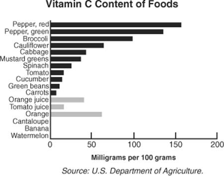
1. What is the ratio of the amount of Vitamin C in 500 grams of orange to the amount of Vitamin C in 500 grams of orange juice?
(A) 4:7 (B) 1:1 (C) 7:4 (D) 2:1 (E) 4:1
2. How many grams of tomato would you have to eat to be certain of getting more vitamin C than you would get by eating 100 grams of raw broccoli?
(A) 300
(B) 500
(C) 750
(D) 1200
(E) 1650
Questions 3–5 refer to the following graphs.
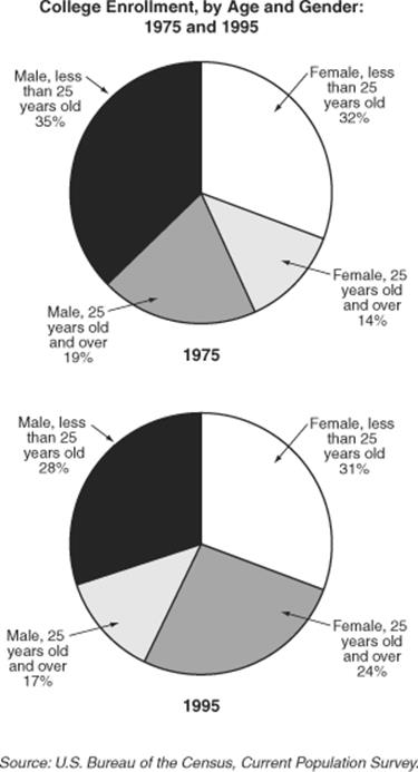
3. If there were 10,000,000 college students in 1975, how many more male students were there than female students?
(A) 800,000
(B) 1,600,000
(C) 2,400,000
(D) 4,600,000
(E) 5,400,000
4. In 1975 what percent of female college students were at least 25 years old?
(A) 14%
(B) 30%
(C) 45%
(D) 69%
(E) 76%
5. If the total number of students enrolled in college was 40% higher in 1995 than in 1975, what is the ratio of the number of male students in 1995 to the number of male students in 1975?
(A) 5:6 (B) 6:7 (C) 7:6 (D) 6:5 (E) 7:5
Questions 6–8 refer to the following graph.
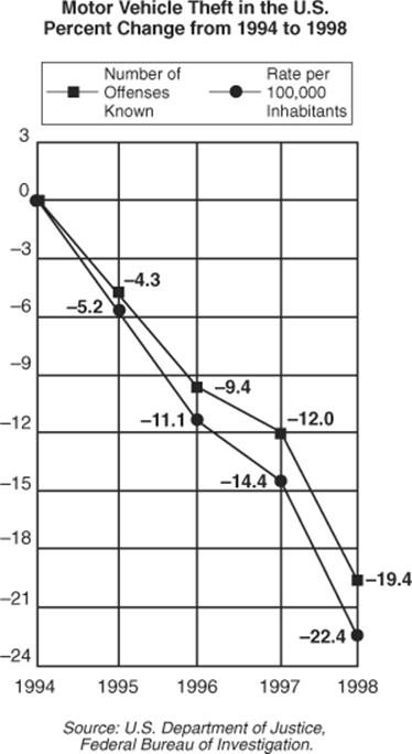
6. If 1,000,000 vehicles were stolen in 1994, how many were stolen in 1996?
(A) 889,000
(B) 906,000
(C) 940,000
(D) 1,094,000
(E) 1,100,000
7. By what percent did the number of vehicles stolen decrease from 1997 to 1998?
(A) 7.4%
(B) 8.0%
(C) 8.4%
(D) 12.0%
(E) 19.4%
8. To the nearest percent, by what percent did the population of the United States increase from 1994 to 1998?
(A) 1% (B) 2% (C) 3% (D) 4% (E) 5%
Questions 9–10 refer to the following graph.
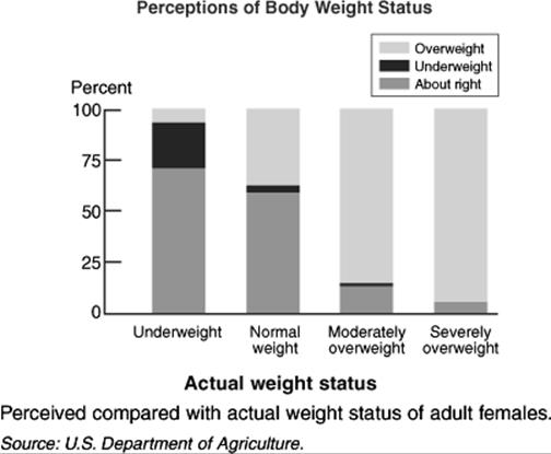
9. What percent of underweight adult females perceive themselves to be underweight?
(A) 5%
(B) 22%
(C) 38%
(D) 50%
(E) 70%
10. The members of which of the four groups had the least accurate perception of their body weight?
(A) Underweight
(B) Normal weight
(C) Moderately overweight
(D) Severely overweight
(E) It cannot be determined from the information given in the graph.
Questions 11–12 refer to the following table.
Residents of New York City pay both New York State and New York City tax.
Residents of New York State who live and work outside of New York City pay only New York State tax.
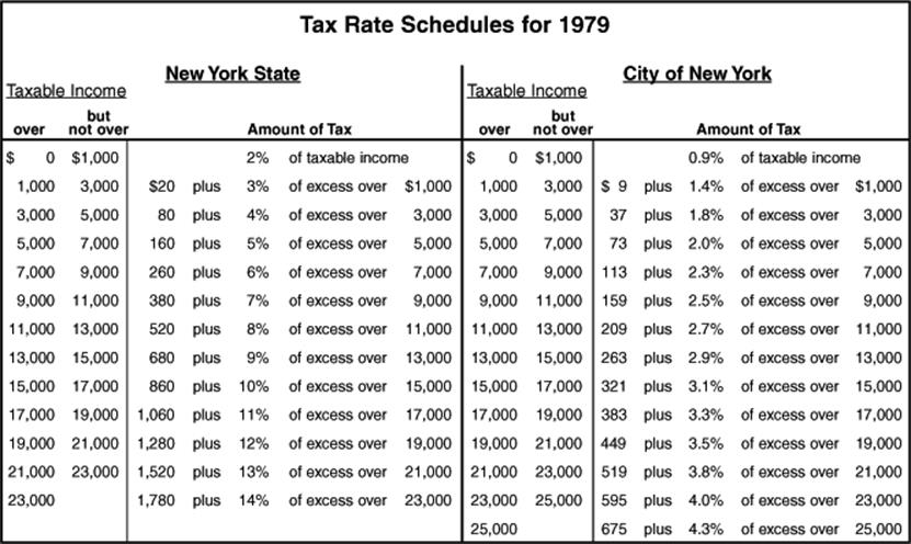
11. In 1979 how much tax would a resident of New York State who lived and worked outside New York City have paid on a taxable income of $16,100?
(A) $34
(B) $110
(C) $352
(D) $970
(E) $1322
12. In 1979, how much more total tax would a resident of New York City who had a taxable income of $36,500 pay, compared to a resident of New York City who had a taxable income of $36,000?
(A) $21.50
(B) $43
(C) $70
(D) $91.50
(E) $183
Questions 13–14 refer to the following tables.
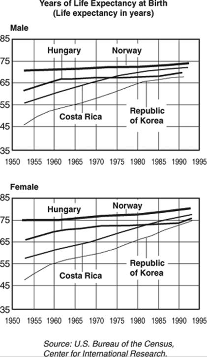
13. For how many of the countries listed in the graphs is it true that the life expectancy of a female born in 1955 was higher than the life expectancy of a male born in 1990?
(A) None (B) 1 (C) 2 (D) 3 (E) 4
14. By sex and nationality, who had the greatest increase in life expectancy between 1955 and 1990?
(A) A Korean female
(B) A Korean male
(C) A Costa Rican female
(D) A Costa Rican male
(E) A Norwegian female
Question 15 refers to the following graph.
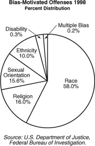
15. If in 1998 there were 10,000 bias-motivated offenses based on ethnicity, how many more offenses were based on religion than on sexual orientation?
(A) 4
(B) 40
(C) 400
(D) 4000
(E) 40,000
ANSWER KEY
|
1. c |
4. B |
7. C |
10. A |
13. B |
|
2. E |
5. C |
8. D |
11. D |
14. A |
|
3. A |
6. B |
9. B |
12. D |
15. C |
Answer Explanations
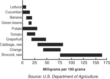
1. (C) According to the graph on the left, there are approximately 70 milligrams of vitamin C in 100 grams of orange and 40 milligrams in the same amount of orange juice. This is a ratio of 70:40 = 7:4. Since the question refers to the same amount of orange and orange juice (500 grams), the ratio is unchanged.
2. (E) From the graph on the right, you can see that by eating 100 grams of raw broccoli, you could receive as much as 165 milligrams of vitamin C. Since 100 grams of tomato could have as little as 10 milligrams of vitamin C, you would have to eat 1650 grams of tomato to be sure of getting 165 milligrams of vitamin C.
3. (A) From the top graph, we see that in 1975, 54% (35% + 19%) of all college students were male, and the other 46% were female. So there were 5,400,000 males and 4,600,000 females — a difference of 800,000.
4. (B) In 1975, of every 100 college students, 46 were female — 32 of whom were less than 25 years old, and 14 of whom were 25 years old and over. So, 14 of every 46 female students were at least 25 years old. Finally, ![]() = .30 = 30%.
= .30 = 30%.
5. (C) From the two graphs, we see that in 1975 54% (35% + 19%) of all college students were male, whereas in 1995 the corresponding figure was 45% (28% + 17%). For simplicity, assume that there were 100 college students in 1975, 54 of whom were male. Then in 1995, there were 140 college students, 63 of whom were male (45% of 140 = 63). So the ratio of the number of male students in 1995 to the number of male students in 1975 is 63:54 = 7:6.
6. (B) From 1994 to 1996 there was a 9.4% decrease in the number of vehicles stolen. Since 9.4% of 1,000,000 = 94,000, the number of vehicles stolen in 1996 was 1,000,000 – 94,000 = 906,000. If you can’t solve problems such as this, you have to guess. But since the number of stolen vehicles is clearly decreasing, be sure to eliminate Choices D and E first.
7. (C) For simplicity, assume that 1000 vehicles were stolen in 1994. By 1997, the number had decreased by 12.0% to 880 (12% of 1000 = 120, and 1000 – 120 = 880); by 1998, the number had decreased 19.4% to 806 (19.4% of 1000 = 194 and 1000 – 194 = 806). So from 1997 to 1998, the number of vehicles stolen decreased by 74 from 880 to 806. This represents a decrease of ![]() = .084 = 8.4%.
= .084 = 8.4%.
8. (D) Simplify the situation by assuming that in 1994 the population was 100,000 and there were 1000 vehicles stolen. As in the solution to question 7, in 1998 the number of stolen vehicles was 806. At the same time, the number of thefts per 100,000 inhabitants decreased 22.4% from 1000 to 776. So if there were 776 vehicles stolen for every 100,000 inhabitants, and 806 cars were stolen, the number of inhabitants must have increased. To know by how much, solve the proportion: ![]() . Cross-multiply: 776x = 80,600,000.
. Cross-multiply: 776x = 80,600,000.
Divide by 776: x = 103,800. So for every 100,000 inhabitants in 1994, there were 103,800 in 1998, an increase of 3.8%.
9. (B) The bar representing underweight adult females who perceive themselves to be underweight extends from about 70% to about 95%, a range of approximately 25%. Choice B is closest.
10.(A) Almost all overweight females correctly considered themselves to be overweight; and more than half of all females of normal weight correctly considered themselves “about right.” But nearly 70% of underweight adult females inaccurately considered themselves “about right.”
11.(D) Referring only to the New York State table, we see that the amount of tax on a taxable income between $15,000 and $17,000 was $860 plus 10% of the excess over $15,000. Therefore, the tax on $16,100 is $860 plus 10% of $1,100 = $860 + $110 = $970.
12.(D) According to the tables, each additional dollar of taxable income over $25,000 was subject to a New York State tax of 14% and a New York City tax of 4.3%, for a total tax of 18.3%. Therefore, an additional $500 in taxable income would have incurred an additional tax of 0.183 × 500 = $91.50.
13.(B) In Norway, the life expectancy of a female born in 1955 was 75 years, which is greater than the life expectancy of a male born in 1990. In Hungary, the life expectancy of a female born in 1955 was 66 years, whereas the life expectancy of a male born in 1990 was greater than 67. In the other two countries, the life expectancy of a female born in 1955 was less than 65 years, and the life expectancy of a male born in 1990 was greater than 65.
14.(A) The life expectancy of a Korean female born in 1955 was about 51 and in 1990 it was about 74, an increase of 23 years. This is greater than any other nationality and sex.
15.(C) Since there were 10,000 bias-motivated offenses based on ethnicity, and that represents 10% of the total, there were 100,000 bias-motivated offenses in total. Of these, 16,000 (16% of 100,000) were based on religion, and 15,600 (15.6% of 100,000) were based on sexual orientation. The difference is 400.