High School Algebra II Unlocked (2016)
Chapter 7. Making and Using Mathematical Models
Lesson 7.2. Interpreting Equations, Tables, and Graphs
REVIEW
Surface area of sphere: S = 4πr2 where S = surface area and r = radius
Volume of sphere: V = 4/3 πr3 where V = volume and r = radius
From equations, tables, and graphs, you can determine various key features of functions, such as intercepts, periods of increase or decrease, and much more. Interpreting these features within the context of the situation that the function describes reveals information about the relationship it represents.

Felice bought shares in a consumer electronics and computer software company, and has been tracking the price per share on the stock market for the past 8 days, as shown in the graph below.
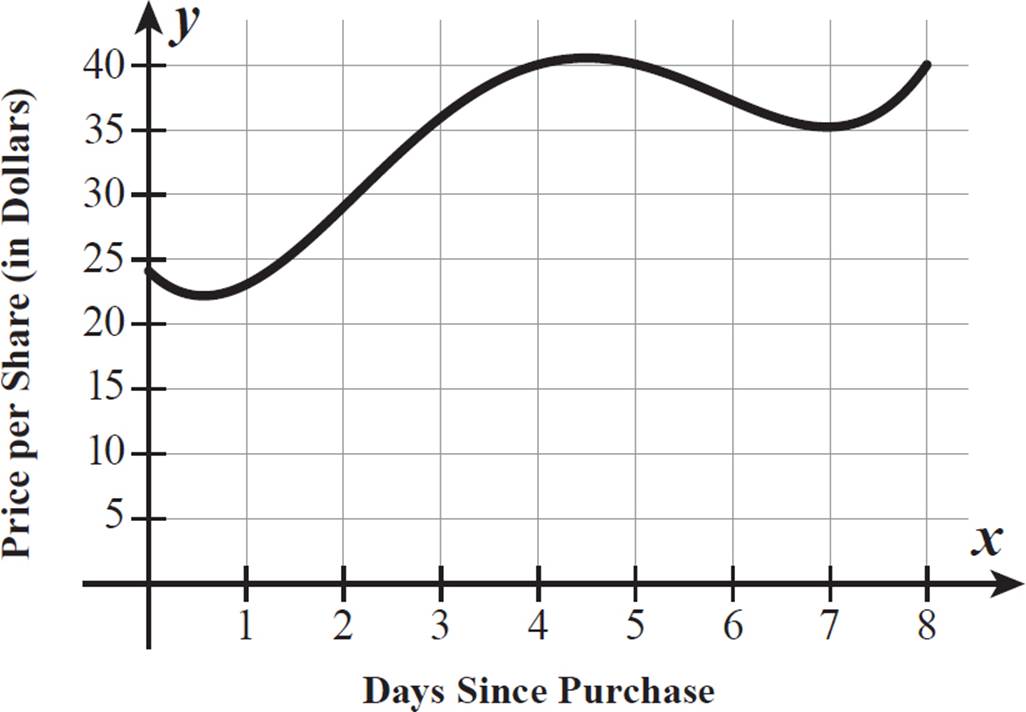
Between which days (whole numbers only) was the share price increasing? What does the y-intercept of this graph represent in the context of the situation? By approximately how much did the share price increase from when Felice bought it to day 8? Between which whole numbers of days did the share price reach its maximum?
The graph rises from left to right between x = 1 and x = 4 and again between x = 7 and x = 8. The share price was increasing between day 1 and day 4, as well as between day 7 and day 8.
The y-intercept is where the graph intersects the y-axis, when x = 0. The x-values represent days since Felice purchased the shares, and the y-values represent share prices, so the y-intercept at (0, 24) represents a share price of $24 when Felice purchased the shares. She bought the shares for $24 each.
On day 8, the graph indicates a share price of $40. From when Felice bought the shares to day 8, the share price increased by $16 (40 − 24 = 16).
The share price reached its maximum, above $40, between 4 and 5 days after Felice bought the shares.


Mr. Davis asked each of his students to measure the length of his desk to the nearest tenth of a centimeter, then recorded their measurements. He said that the relative error of each of their measurements is a function value on the graph ofr(x) = 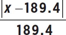 . Relative error of a measurement is the ratio of the absolute error of the measurement to the true value (in this case the actual length of the desk). What do x and r(x) represent in this function? What does the number 189.4 represent? What are the limitations on the domain of this function, given the situation? What does the x-intercept of the graph represent?

In Chapter 6, Lesson
6.2, we explored
absolute value
functions. Here is a
real-life application for
a situation where only
the positive difference
in length is wanted.
Without an absolute
value sign, the function
would produce
negative values for
any measurement
less than 189.4 and
positive values for
any measurement
greater than 189.4.
Relative error is defined to be a ratio of absolute error of the measurement to the actual (true) measurement, so r(x) represents the relative error, and 189.4 is the actual measurement. Mr. Davis’s desk is actually 189.4 centimeters long. So, x must represent a measurement result, such as those of Mr. Davis’s students.
Because x is a measurement of length, it must be a positive number. The domain of r(x) is x > 0.
The x-intercept occurs when r(x) = 0, so the x-intercept represents a measurement of exactly 189.4, resulting in a relative error of 0.
This function must
represent how far
off the students’
measurements are
from the actual
length of the desk.


One day, Mariah recorded the outdoor temperature in Nome, Alaska, at various times throughout the day. She recorded the values in the table below, with x representing hours into the day (for example, x = 6 represents 6:00 A.M.) and f(x) representing temperature, in degrees Fahrenheit.
|
x |
f(x) |
|
|
6 |
−5 |
|
|
8 |
3 |
|
|
10 |
12 |
|
|
11 |
20 |
|
|
14 |
29 |
|
|
16 |
23 |
|
|
19 |
4 |
If the temperatures were continuously recorded throughout the day, the graph of f(x) could be drawn as a continuous function with a domain of all real numbers from x = 0 to x = 24. In what range of times must there be an x-intercept for this function? What does this represent? If there is only one local maximum value for the function, in what range of times must it be? If the function has no local minimums, for what period of time is the function definitely decreasing?
An x-intercept occurs when f(x) = 0. Because the function is continuous and has a negative value at x = 6 and a positive value at x = 8, it must cross the x-axis somewhere between 6 and 8. So, the temperature must have been 0°F sometime between 6:00 A.M.and 8:00 A.M.
With only one
local maximum for
the function, the
temperatures only
change from increasing
to decreasing once
during this day. If
there were multiple
local maximums,
then there could have
been another local
maximum, for
example at 6:00 P.M.,
with a higher
temperature than the
one earlier in the day.
Although the maximum f(x)-value given in Mariah’s table is 29, this may or may not be the maximum value for the function. We know that the temperature was 20° F at 11:00 A.M. and 29° F at 2:00 P.M., but we do not know the temperatures in between those times. Perhaps the temperature reached a maximum higher than 29° F and was falling again by 2:00 P.M. Or, it’s possible that the maximum didn’t occur until after 2:00 P.M. but before 4:00 P.M., when the temperature was down to 23° F. All we can conclude is that the local maximum temperature must have occurred sometime between 11:00 A.M. and 4:00 P.M.
If the function has only one local maximum and no local minimums, then it only decreases after its maximum. We do not know exactly when the maximum occurred, but we know it was before 4:00 P.M. After 4:00 P.M., the temperature is definitely decreasing (from 4:00 P.M. to midnight).


Toby used the formulas for the surface area of a sphere and the volume of a sphere to find formulas for the radius of a sphere, given its surface area or volume. Using his calculator, he simplified the coefficients in the two functions, to get r = 0.28![]() and r = 0.62
and r = 0.62![]() . These two functions are shown on the graphs below.
. These two functions are shown on the graphs below.
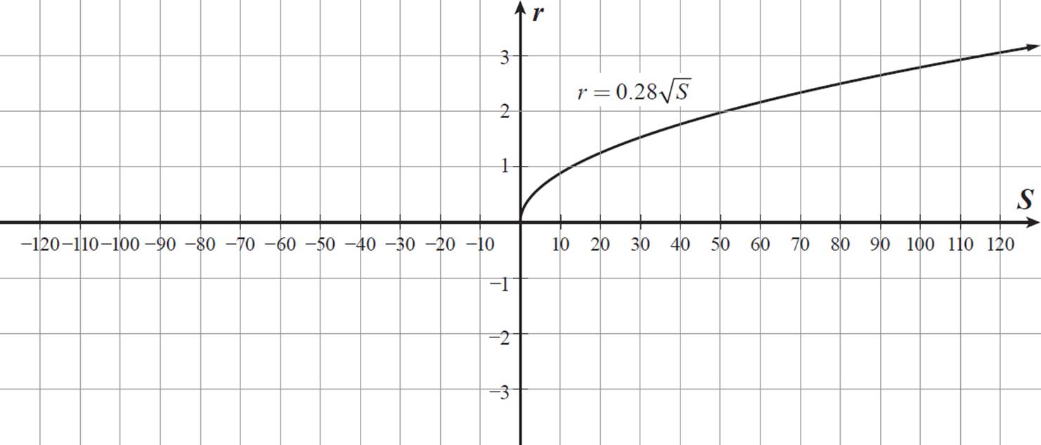
What is the difference between the domains of the two graphed functions? Why are they different? What additional domain restriction(s), if any, should Toby use to make the graphs appropriately represent the data for this particular situation?
The graph of r = 0.62![]() has a domain of all real numbers, because its arms are extending forever to the left and right, as a cube root function. The graph of r = 0.28
has a domain of all real numbers, because its arms are extending forever to the left and right, as a cube root function. The graph of r = 0.28![]() , however, has a domain of only S ≥ 0. It begins at the r-axis and continues forever to the right. The square root
, however, has a domain of only S ≥ 0. It begins at the r-axis and continues forever to the right. The square root ![]() is always positive, so the function r = 0.28
is always positive, so the function r = 0.28![]() only has positive function values, unlike the cube root function, which can have both positive and negative function values.
only has positive function values, unlike the cube root function, which can have both positive and negative function values.
The domain of the function r = 0.28![]() represents surface areas of spheres, so S ≥ 0 is an appropriate domain. The domain of function r = 0.62
represents surface areas of spheres, so S ≥ 0 is an appropriate domain. The domain of function r = 0.62![]() represents volumes of spheres, so negative values of V are inappropriate. Toby should restrict the domain of r = 0.62
represents volumes of spheres, so negative values of V are inappropriate. Toby should restrict the domain of r = 0.62![]() to V ≥ 0 for this particular situation.
to V ≥ 0 for this particular situation.
You could also argue
that a sphere with a
surface area of 0 or
a volume of 0 does
not exist as a sphere,
which means that the
domain for r = 0.28![]()
should be restricted to
S > 0 and the domain
for r = 0.62![]() should
should
be restricted to V > 0.


Emily and Masaru decided to start a glee club at their school and were the first two members. Values for the total number of students in the glee club, g(x), after x weeks are shown in the table below.
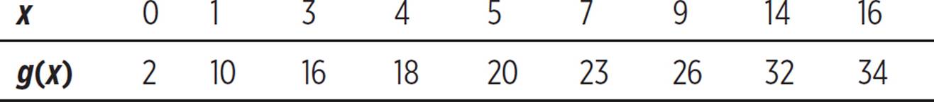
What does the y-intercept (the g(x)-intercept) of this function represent? What was the average rate of change of g(x) from x = 0 to x = 16? What does this represent? What was the average rate of change of g(x) from x = 0 to x = 4? What does this represent? Based on this information, what can you conclude about the growth of the glee club over the time period shown?
The x-values represent weeks since the glee club was founded, and the g(x)-values represent the total number of glee club members at that time. The y-intercept, when x = 0, represents the glee club membership after 0 weeks, when it had just been founded. According to the table, when x = 0, g(x) = 2, so at founding, the glee club had exactly 2 members.
When x = 16, there are 34 glee club members. The rate of change of club membership is the change in membership divided by the change in time (in this case, the number of weeks since the club was founded).
 = 32/16 = 2
The rate of change from x = 0 to x = 16 is 2. This means that, over the first 16 weeks, the glee club’s membership increased at an average rate of 2 members per week.
Look at the table to find the x-value of 4, which corresponds to a g(x)-value of 18. Find the average rate of change from (0, 2) to (4, 18).
 = 16/4 = 4
The rate of change from x = 0 to x = 4 is 4. This means that, over the first 4 weeks, the glee club’s membership increased at an average rate of 4 members per week. This rate of change is twice the rate of change for the entire 16 weeks shown, even though 4 weeks is only 1/4 of the full time period. The glee club’s membership increased very quickly over the first 4 weeks but slowed down substantially over later weeks.


A town has two different postal stations, one for the east side and one for the west side, with the same number of households served by each station. All the mail carriers working within a station have the same average mail delivery rate, in households per hour, but the east-side mail carriers have a different delivery rate than the west-side mail carriers. Examples of time, t, in hours, that it takes x east-side mail carriers, working simultaneously, to deliver to all east-side households are given in the table below.
|
x |
t |
|
3 |
40 |
|
4 |
30 |
|
6 |
20 |
|
8 |
15 |
|
15 |
8 |

Here is how you may see interpreting graphs on the SAT.
After Hurricane Katrina caused high rates of homelessness in New Orleans, efforts were made to provide housing opportunities for the homeless. Estimates of the homeless population are shown in the scatterplot below.
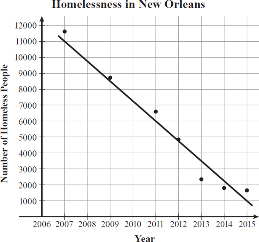
Based on the line of best fit in the scatterplot above, which of the following is closest to the average annual decrease in the homeless population in New Orleans between 2007 and 2015?
A) −1000
B) −1250
C) −1500
D) −1750
On the west side, the number of mail carriers working simultaneously and the number of hours it takes them to deliver to all west-side households are inversely proportional, with a constant of variation of 128. On which side of town do the mail carriers have a faster mail delivery rate? What kind of function can be written that correctly relates t to x for each side of town? For each of these functions, based on the domain values for the given situation, is a graph of the function or a table of values a more appropriate model for the relationship?
In the table of values for east-side carriers, when x doubles, t is halved, so t varies inversely as x. This means that the product of t and x is the constant of proportion, which in this case is 120 (3 ⋅ 40 = 120, 4 ⋅ 30 = 120, and so on). So, t = 120/x describes the relationship in this table.
Compare the values in
two rows of the table.
When x = 3, t = 40, and
when x = 6, t = 20. In
this case, doubling x
resulted in halving t.
Compare another two
rows in the table to
make sure the same
relationship holds true.
When x = 4, t = 30,
and when x = 8,
t = 15. Again, doubling
x caused t to be
divided by 2. The
relationship is an
inverse variation.
The number of west-side mail carriers and the time it takes them to deliver all west-side mail is again an inverse variation relationship, this time with a constant of variation of 128. So, t = 128/x describes the relationship for the west-side mail carriers.
For any positive x-value, the equation t = 128/x will produce a greater t-value than the equation t = 120/x. The variable t represents the time it takes the mail to be delivered, so it takes the west-side mail carriers more time to deliver the mail. The same number of households is served by each station, so the west-side mail carriers are slower. The east-side mail carriers have a faster delivery rate.
The functions t = 128/x and t = 120/x are both rational functions. The domain, or set of x-values, for each function represents the number of mail carriers simultaneously working to deliver mail on one side of town. So, the domain consists only of whole numbers for this situation. A graph of either rational function would include all real-number values of x (except for 0), including all values between consecutive whole numbers. A table of values is a more appropriate model, because x-values can be limited to only whole numbers in the table.


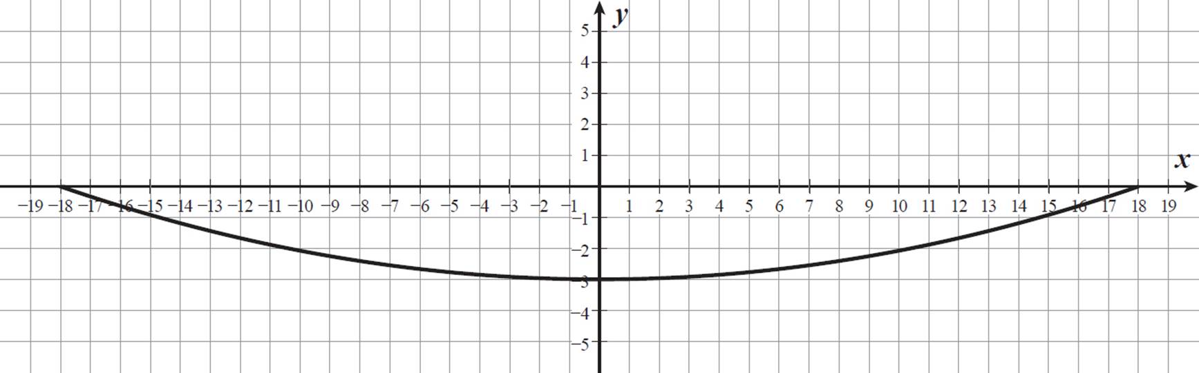
The cross-section of a satellite dish is in the shape of a portion of a parabolic curve. Luis graphed the cross-section of his television satellite dish on a coordinate grid, with the rim of the dish aligned with the x-axis and the center of the dish aligned with the y-axis, as shown below. Units on both axes represent distances in inches.
Priscilla has a television satellite dish with a cross-section that can be similarly graphed using the equation y = 1/36 x2 − 9/4, with y ≤ 0. Which function has a greater positive x-intercept? What does this value represent? Which function has a minimum with a greater absolute value? What does this value represent? How do the dimensions of Luis’s and Priscilla’s satellite dishes compare?
The x-intercept of Luis’s graph is 18. The x-intercept occurs when y = 0, so substitute 0 for y in the equation for Priscilla’s satellite dish.
|
0 = 1/36 x2 − 9/4 |
|
|
9/4 = 1/36 x2 |
Add 9/4 to both sides. |
|
81 = x2 |
Multiply both sides by 36. |
|
±9 = x |
Take the square root of both sides. |

The slope of a line is the change in y-values over the change in x-values. In this case, the slope represents a change in the number of homeless people per year, as an average.
Use the points on the line of best fit for the years 2007 and 2015. The line of best fit passes through the points (2007, 11000) and (2015, 1000).
slope =  = −10000/8 = −1250
The slope of the line is −1250, which represents a decrease (because it is negative) in the number of homeless people in New Orleans, of about 1250 people per year. The correct answer is (B).
Priscilla’s function has x-intercepts of −9 and 9. Comparing the positive intercepts, Luis’s x-intercept of 18 is greater than Priscilla’s x-intercept of 9. Both functions are symmetrical with respect to the y-axis, so the positive x-intercept value represents the radius of the satellite dish.
The minimum function value on Luis’s graph is −3. The minimum function value of the quadratic function y = 1/36 x2 − 9/4 is −9/4, which is equal to −2 1/4. Luis’s function has a minimum with a greater absolute value, 3, as compared to Priscilla’s, 2 1/4. This represents the depth, or height, of each satellite dish.
The diameter of a circle is twice the radius. Luis’s satellite dish is 36 inches in diameter and 3 inches deep, and Priscilla’s satellite dish is 18 inches in diameter and 2 1/4 inches deep. Luis’s satellite dish is twice as wide as Priscilla’s but just a little deeper.
The graph of Priscilla’s
satellite dish is defined
to be limited to
y ≤ 0, as in Luis’s
graph. Another way to
view the limitation is in
terms of the domain of
the graph. Luis’s graph
has a domain of
−18 ≤ x ≤ 18, or
|x| ≤ 18, and Priscilla’s
graph has a domain
of −9 ≤ x ≤ 9, or
|x| ≤ 9. This shows that
the parabolic curves
each extend only to
a maximum of the
radius length in each
direction from center.
