SAT Test Prep
CHAPTER 11
ESSENTIAL ALGEBRA 2 SKILLS
Lesson 5: Data Analysis
Scatterplots and Lines of Best Fit
A scatterplot is a collection of points plotted on a graph that is used to visualize the relationship between two variables. A line of best fit is a straight line that best “hugs” the data of a scatterplot. This line usually divides the points roughly in half. This line can be used to make predictions about how one of the variables will change when the other is changed.
The SAT may ask you to describe the basic features of a line of best fit for a set of data, but it won”t ask you to find this equation exactly. You can usually just eyeball it: draw a line that fits the data and cuts the points roughly in half, and then notice whether the slope of the line is positive, negative, or 0, and then notice roughly where its y-intercept is.
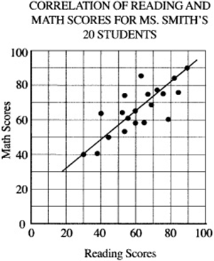
Example:
What is the approximate slope of the line of best fit in the scatterplot above?
To estimate the slope of a line of best fit, pick two points on your line of best fit and use the slope equation (from Chapter 10, Lesson 4) to solve for m. It appears that the line of best fit connects the points (30, 40) and (90,90), SO ![]() .
.
Tables, Charts, and Graphs
A table is a set of data arranged in rows and columns. If an SAT question includes a table, always read the table carefully first, paying special attention to the axis labels, and try to understand what the table represents before tackling the question. If you are given two tables, make sure you understand how the two tables are related.
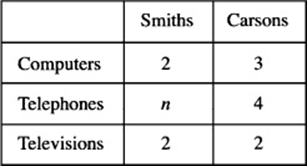
ELECTRONICS IN THE SMITH AND CARSON HOUSEHOLDS
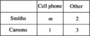
TELEPHONES IN THE SMITH AND CARSON HOUSEHOLDS
Example:
If the Smiths own as many pieces of electronic equipment as the Carsons do, how many cell phones do the Smiths own?
Start with the first table. The Carsons own ![]() pieces of equipment. If the Smiths own the same number of pieces, they must own
pieces of equipment. If the Smiths own the same number of pieces, they must own ![]() telephones. Now go to the “Telephones” table. Since the Smiths have five telephones and two are not cell phones, they must own
telephones. Now go to the “Telephones” table. Since the Smiths have five telephones and two are not cell phones, they must own ![]() cell phones.
cell phones.
As with tables, always carefully read the labels of pie charts to understand what the data represent before tackling the question. In a pie chart, a sector containing x% of the data has a central angle of (x/100)(360°).
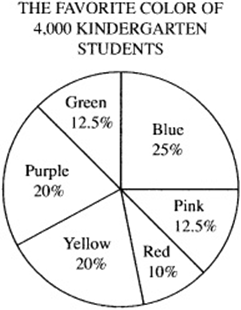
Example:
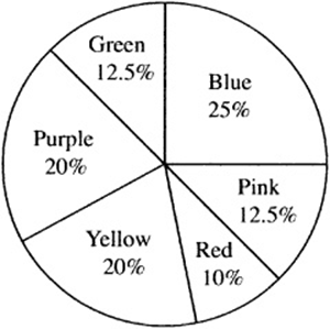
In the pie chart above, what is the angle measure of the sector represented by the color purple?
Purple accounts for 20% of the circle, and 20% of ![]() .
.
Concept Review 5: Data Analysis
1. What is a line of best fit?
2. How is a line of best fit created?
3. How do you estimate the slope of a best fit line?
4. When given percentages in a pie chart, how do you determine how many degrees each sector represents?
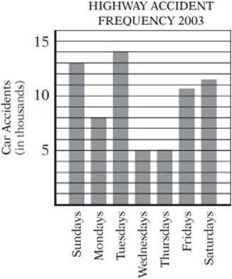
Questions 5 and 6 refer to the bar graph at right:
5. The largest percent increase in number of accidents occurred between which two days of the week?
6. Approximately what percentage of the accidents occurred on Friday, Saturday, or Sunday?
Questions 7–9 refer to the pie chart at right:
7. The pie chart shows the results of a survey that asked 4,000 kindergarten students their favorite color. How many more students said yellow was their favorite color than said blue was their favorite color?
8. What is the degree measure of the sector of the circle that represents red?
9. Using the data in the pie chart, how many students would have to change their answer to blue in order for blue to account for 50% of the data?
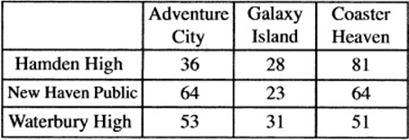
Questions 10 and 11 refer to the tables at right:
10. According to the tables, which school ordered the most amusement park tickets?
11. If all the students who went to Coaster Heaven from New Haven Public and Hamden High bought 5-day passes, how much more money did Hamden High spend than New Haven Public did at Coaster Heaven?
NUMBER OF PARK TICKETS ORDERED
PRICE OF ADMISSION

SAT Practice 5: Data Analysis
Questions 1 and 2 refer to the following information:
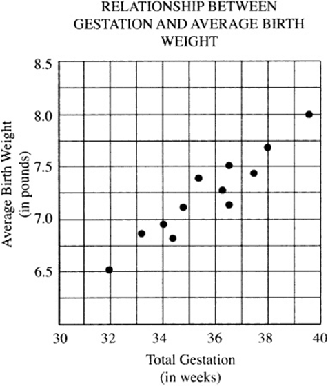
1. Which of the following best approximates the slope m (in pounds per week) of the line that best approximates these data?
![]()
![]()
![]()
![]()
![]()
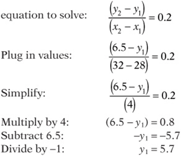
2. If the line of best fit for the data presented above passed through the points (32, 6.5) and (39.5, 8.0), it can be estimated that a baby born at 28 weeks would most nearly weigh how many pounds?
(A) 5.3
(B) 5.5
(C) 5.7
(D) 5.9
(E) 6.1
MONTHLY TICKET SALES AT WACKY WATER PARK
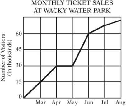
3. According to the graph above, Wacky Water Park experienced its largest increase in park attendance between which two consecutive months?
(A) March and April
(B) April and May
(C) May and June
(D) June and July
(E) July and August Revenue per Unit
COST/REVENUE ANALYSIS FOR THE TRINKET FACTORY
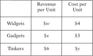
4. The table above shows the per unit revenue and cost of three products at the Trinket Factory. If profit equals revenue minus cost, how much profit do they make if they produce and sell two of each item?
![]()
![]()
![]()
![]()
![]()
Questions 5 and 6 refer to the following tables:
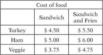
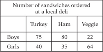
5. Based on the tables above, if every boy bought a sandwich without fries and every girl bought a sandwich with fries, how much more money did the boys spend at the deli than the girls?
6. If the girls who bought turkey sandwiches have $206 in total to spend on their lunches, what is the greatest number of turkey sandwiches with fries they could buy without exceeding their budget?
(A) 23
(B) 24
(C) 25
(D) 26
(E) 27
Answer Key 5: Data Analysis
Concept Review 5
1. A best fit line is a straight line that “hugs” the data most closely on a scatterplot.
2. It can be created by connecting the “outermost” points on the plot or by drawing a line that best “hugs” the points and divides them in half. Try to ignore any outliers that don”t fit with the rest of the data.
3. For the SAT, you just need to be able to tell if a slope is positive or negative, or perhaps greater or less than 1. Positive slopes go up to the right, and negative slopes go down to the right. If the slope is positive and the “rise” is greater than the “run,” the slope is greater than 1; if the rise is less than the run, the slope is less than 1.
4. If you know what percent of the data are in a sector of the pie chart, multiply the percentage by 360° to obtain the degree measure of that sector (e.g., a sector that represents 40% of the circle would be ![]() .
.
5. The biggest percent change occurs between Thursday and Fridays.
![]()
6. There were a total of ![]() accidents; 35,000 of them occurred on Friday, Saturday, or Sunday.
accidents; 35,000 of them occurred on Friday, Saturday, or Sunday. ![]()
7. 25% of the kids said blue was their favorite color. 25% of ![]() of the kids said yellow was their favorite color. 20% of
of the kids said yellow was their favorite color. 20% of ![]() .
. ![]() .
.
8. The color red represents 10% of the circle, which is 10% of  .
.
9. There are currently ![]() votes for blue. In order for blue to be 50% of the circle, it would need
votes for blue. In order for blue to be 50% of the circle, it would need ![]() votes. Therefore, 1,000 votes must change.
votes. Therefore, 1,000 votes must change.
10. Hamden High ordered ![]() tickets. New Haven Public ordered
tickets. New Haven Public ordered ![]() . Waterbury High ordered
. Waterbury High ordered ![]() .
.
11. 81 Hamden High students bought 5-day passes at $200.00/pass, spending ![]() . students at New Haven Public bought 5-day passes at $200/pass, spending
. students at New Haven Public bought 5-day passes at $200/pass, spending ![]() . The difference is
. The difference is ![]() .
.
SAT Practice 5
1. B A line connecting (32, 6.5) and (39.5, 8.0) is a good line of fit, and has a slope of ![]() , which is between 0 and 1.
, which is between 0 and 1.
2. C If the slope is about 0.2, you can use the slope

4. A The revenue generated from two widgets, two gadgets, and two tinkers is $2w, $2x, and $2(6), respectively. The cost of producing two widgets, two gadgets, and two tinkers is $8, $6, and $2 y, respectively. Therefore, the total profit can be found by subtracting the cost from the revenue: ![]() .
.
5. 86 The boys bought only sandwiches and spent ![]() . If the girls bought only sandwiches with fries, then they spent
. If the girls bought only sandwiches with fries, then they spent ![]()
